
Overview
This project involved creating an intuitive and user-centric interface, particularly enhancing usability for bulk actions, horizontal and vertical scrolling, filtering and sorting options, and other complex interactions.
For this project, I embraced an extensive iterative design process, encompassing:
- Meticulous user research
- Feedback collection
- Creation of low-fidelity wireframes
- Iterative testing
- Incorporation of customer complaints
- Utilization of design library components
- Implementation of accessibility guidelines
Team
- UX designer
- UX researcher
- Product manager
- Development team
- Design system team
- Sales engineers
Timeline
- 6 months
Design Process
- Discovery
- Design sprint
- Ideation
- Design
- Testing
- Dev handoff
Research Phase
Problem Statement
This page was the entry point to the user flow throughout the application, but was bulky and difficult to use. This resulted in negative feedback due to its complex navigation and unintuitive interface, and these challenges were amplified by the data-heavy nature of the application.
Goals
- Identify pain points within the current application.
- Understand user expectations and preferences.
- Develop a design that fosters user engagement and satisfaction, especially when dealing with extensive data.
User Research
Conducted comprehensive user interviews, surveys, and competitive analysis to extract insights into user preferences and industry best practices.
Analyzed customer complaints, extracting the most important and frequent pain points, and integrated them into the redesign process to directly address recurring issues and improve user experience.
Facilitated a 1-day design sprint exercise with 12 relevant stakeholders to uncover issues and test general issues.
Feedback Collection
Engaged with existing users through targeted surveys and usability tests to pinpoint specific pain points and gather qualitative feedback.
Collected this feedback at multiple points throughout the process: during initial interviews, with low-fidelity wireframes, and high-fidelity mockups.
Design Phase
User Flows
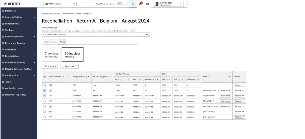
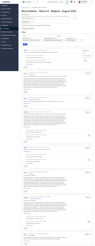
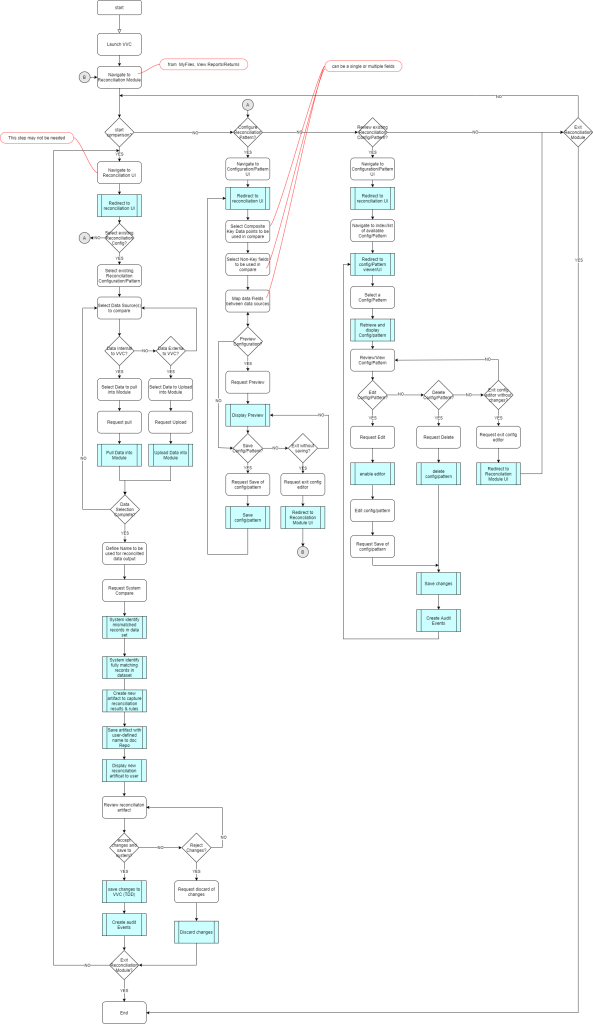
Developed intricate user flows to map out complex user journeys, ensuring seamless navigation and interaction, particularly when dealing with large sets of data.
Iterative Testing
Conducted iterative usability tests with diverse representative users using the low-fidelity wireframes. This process identified usability challenges, enabling iterative refinement.
Low-Fidelity Wireframes
Created initial low-fidelity wireframes using design software, with a keen focus on adapting the design to better accommodate horizontal and vertical scrolling, filtering, and sorting options.
Design Iterations
Continuously refined the low-fidelity wireframes based on user feedback and insights from customer complaints, while maintaining a user-friendly approach to data interaction.
Design Library Components
Utilized the organization’s design library components to ensure consistency while accommodating intricate data presentation.
Accessibility Integration
Incorporated accessible design elements to ensure that the redesigned application met accessibility standards, making it usable for users with varying needs. This involved taking accessibility into account from the very beginning of the redesign, ensuring that proper design patterns and page flow were used.
High-Fidelity Wireframes
Translated the refined low-fidelity wireframes into high-fidelity designs, focusing on seamless horizontal and vertical scrolling, intuitive filtering, sorting, and other data interactions.
Development Phase
Error States and Interactions
During the development phase, careful attention was given to accounting for error states and interactions within the redesigned application. Error states were identified during the iterative testing phase and were systematically addressed to provide users with clear feedback and guidance when errors occurred. This approach helped enhance the overall user experience and minimize frustration.
Accessibility Integration with ARIA Tags
To ensure the application was accessible to all users, I meticulously integrated ARIA (Accessible Rich Internet Applications) tags. These tags provided additional context to assistive technologies, enhancing the usability of the application for individuals with disabilities. A thorough accessibility audit was conducted, and necessary adjustments were made to guarantee compliance with accessibility standards.
Design System Library for Consistency
Previously, the page used its own CSS library, which only became more and more out-of-sync with the company’s design system. Updating the page to use the design system this meant a significant rewrite of the application, but ended up saving time in the end.
By leveraging these standardized components, the design maintained a consistent look and feel across the company’s other applications. This not only ensured a cohesive user experience but also streamlined the development process. Changes made to the design system library automatically propagated throughout the application, minimizing the workload for each team involved. It also meant that my designs, using the most up-to-date Figma library, didn’t need the extra communication for how it would work in the application.
Collaboration and Workload Reduction
I collaborated closely with the development team to ensure seamless implementation. Having prior experience as a developer myself, I was well-versed in understanding the technical limitations and possibilities. This experience enabled smoother communication between design and development, eliminating potential roadblocks and facilitating an efficient translation of design concepts into functional features.
My background as a developer played a pivotal role in making design decisions that were not only visually appealing but also technically feasible. This understanding of development constraints allowed for more realistic expectations and efficient problem-solving during the project’s execution. It also fostered an environment of mutual respect and collaboration between the design and development teams.
Results
Positive Feedback
Users applauded the enhanced usability, particularly when dealing with data-heavy screens. Customer satisfaction scores surged by 25% based on post-interaction surveys.
Lessons Learned
- Data Interaction Expertise: Tailoring the design to accommodate complex data interactions led to a significant increase in user satisfaction.
- User-Centric Approach: Incorporating standard UX processes and user flows facilitated iterative improvements based on user feedback.
- Inclusive Design: Addressing customer complaints and adhering to accessibility guidelines improved the user experience for a diverse audience.
Conclusion
Through a comprehensive UX design process, featuring meticulous research, iterative testing, customer complaint integration, design library component utilization, accessibility compliance, and user flow implementation, a data-heavy application was transformed into an intuitive and user-centric page. The application’s improved metrics and positive user feedback validate the efficacy of this user-centered approach, particularly when optimizing usability for extensive data interactions.