Summary
The Naperville Public Library iOS App offered vast options — but features had been added on, piecemeal, throughout the years, and it had become a maze. So I redesigned it.
I worked on this independently, which involved evaluating the current app, researching alternatives, creating an effective information architecture, and drafting a prototype UI. The library used my prototypes to overhaul the app, and it’s been met with praise from the users.
>
Discovery
User Testing
It was especially important to take the users into account when revamping the app, because public libraries have users from every age group and digital competency. In addition, this library offers far more services than a simple physical book check-out.
I recruited testers ranging from elementary-schoolers to retirees; from digital natives to “where’s the keyboard?”, and asked them to complete several tasks. Their feedback showed me which areas were in most desperate need of overhaul, which aspects worked well, and problems with the app structure in general.
Some of the tasks included:
- Find out when the library closes today.
- Use the app to check out the book you’re holding.
- Check out and download the ebook version of a book.
- Find a recommended book for an elementary schooler.
- See what events are being offered this weekend at a branch.
“Competitive” research
I downloaded and tested several library apps in order to scout features and designs. This let me test the effectiveness of some of my planned features, and guided my ideas for the structure of the app. I had some users test apps with unusual structures, to see if the layout felt more natural to them.
I used this research to put together a brief presentation for the library staff; it covered the ways that the current app could be improved, and invited recommendations for what aspects to include in the revamped app.
You can view a PDF of the library apps here.
Define
Information Architecture
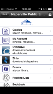
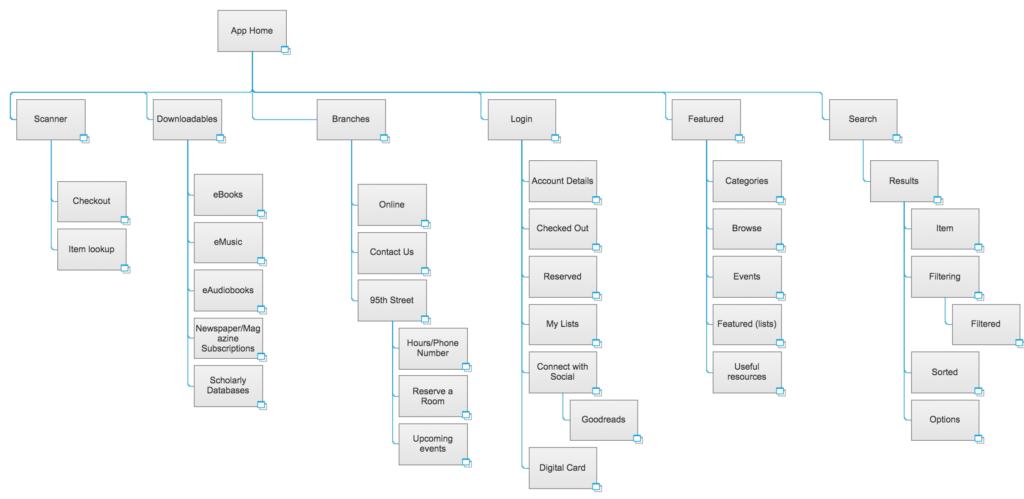
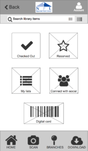
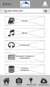
The app hadn’t been overhauled for years; instead, features were tacked onto the existing app until there were 20 links in the home page navigation, without any particular order. I overhauled the IA, arranging features and resources until everything fit together logically: either displayed neatly on the homepage, or in a bottom menu.
Design
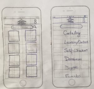
Wireframes
Since there were so many different ways to arrange the app, I created a variety of layouts in order to understand the strengths and weaknesses of each method. By wireframing with paper and pencil first, I could get rapid feedback on the structure, without worrying about design specifics.
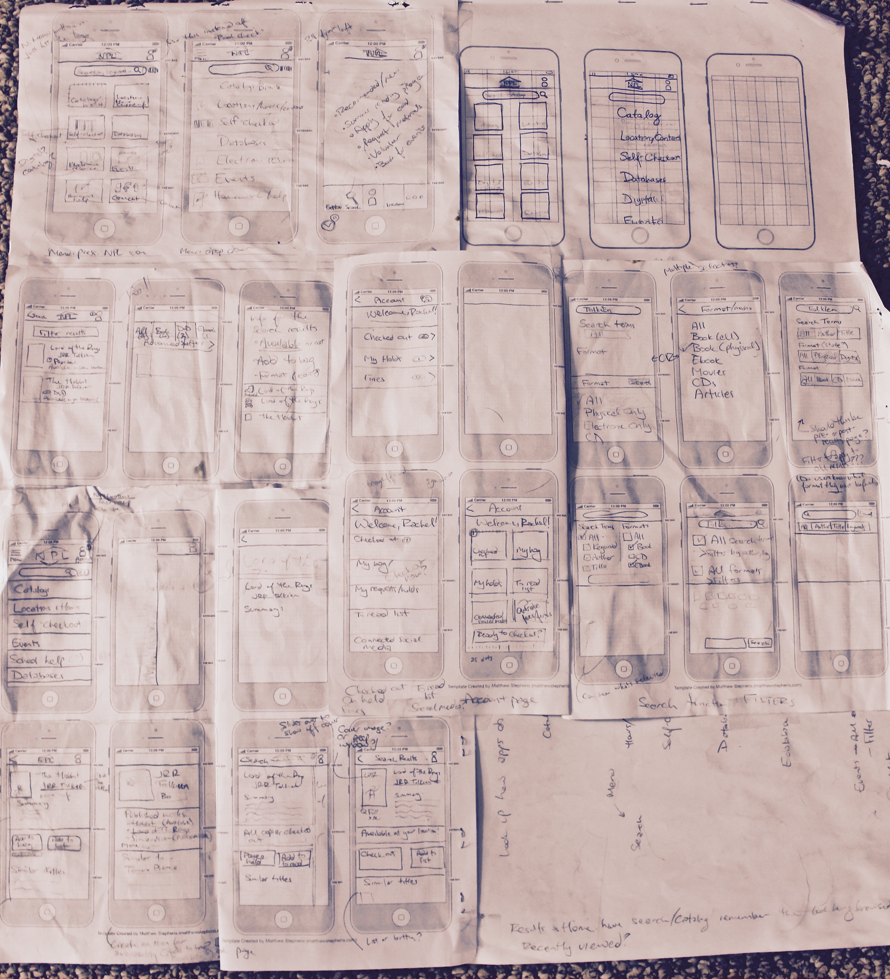
Prototypes
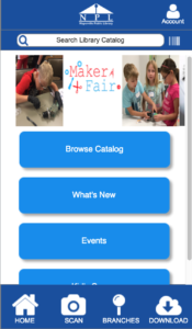
After the wireframes went through several design iterations with paper, I used Axure and Illustrator to show what a more polished app might look like.
Up to this point, everything I had done was just for classes or personal improvement. But with these working wireframes, I decided to finish up the project and present it to the library. I used Axure and Illustrator to create a prototype of the app, usable on a computer or smartphone. I presented it to the head of the library’s technical services, and she loved being able to click through a usable app. She recommended more features that I hadn’t thought of, and encouraged me to continue development.
 |  |
Results
After I passed off my prototypes, I stepped away with work of my own for a few months. By the time I checked back in, the new app had been released! Many aspects of my design made it in, and weaknesses I had mentioned were gone. There are still changes that could be made to improve the app, but it’s finally starting to showcase its features and catch up to the modern age.
Some changes I’d still recommend:
- Overhaul animations: currently, everything slides in from the right, even when going back a page or switching between tabs. This ignores the proper use of animations, which is to provide feedback to the user about where they are going. When everything slides in from one direction, the feedback can seem to go against what the user did. Going back should slide in from the left — switching tabs should have no animation or animate toward the new tab.
- Make the buttons more obviously clickable — even outlines or drop shadows would make the app look more polished and up-to-date.
- Remove the “Back” button from the non sub-pages. Since each tab goes directly back to the home page, then there is no need for the “Back” button.
- It tries to follow Android standard of going to the previous page, rather than up the hierarchy. But the app does not make it clear that it is happening. Instead, add a back/forward button, or rename it “previous”.