Background
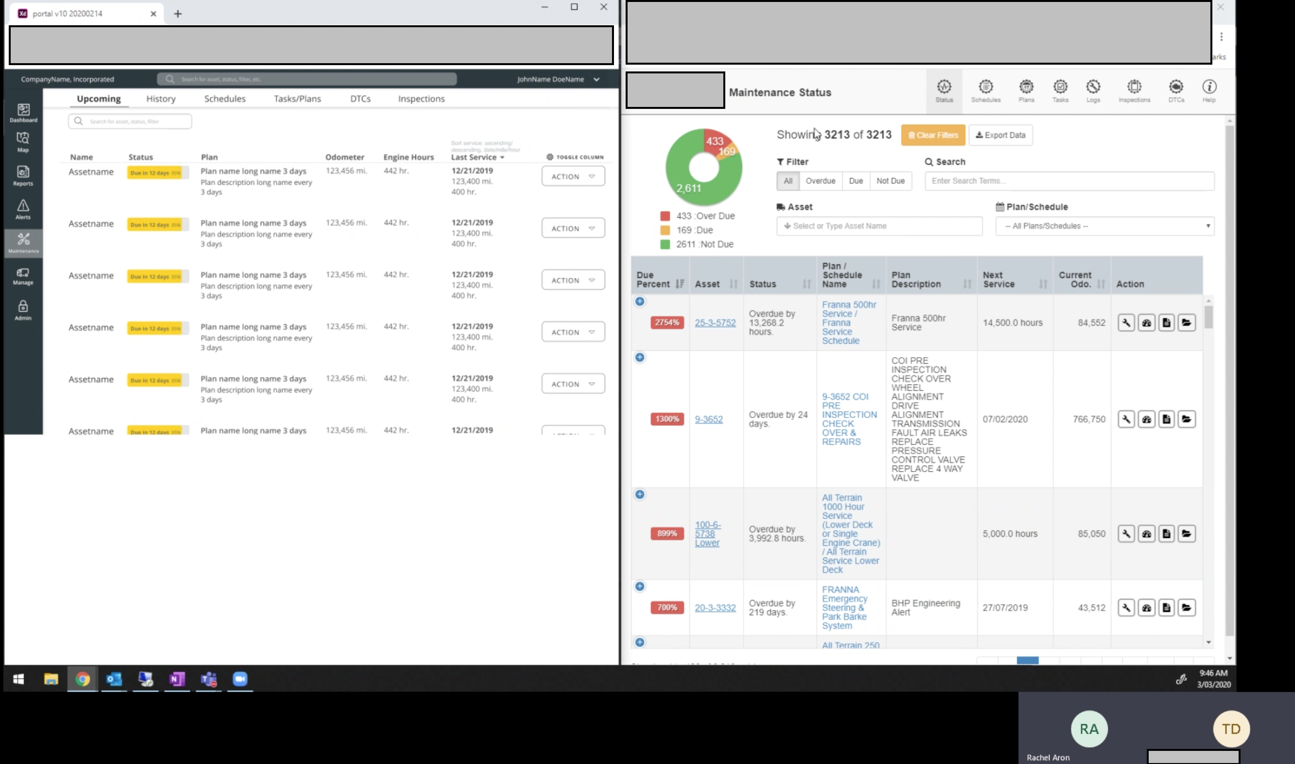
The client was a B2B business offering a GPS Fleet/Asset Management system, based on engine data sent from add-on hardware. Their main product is a web portal (browser, iOS, Android) which displays location and engine data as actionable intelligence, which companies can use to reduce cost, improve utilization, and maximize productivity of their fleet.
The Problem
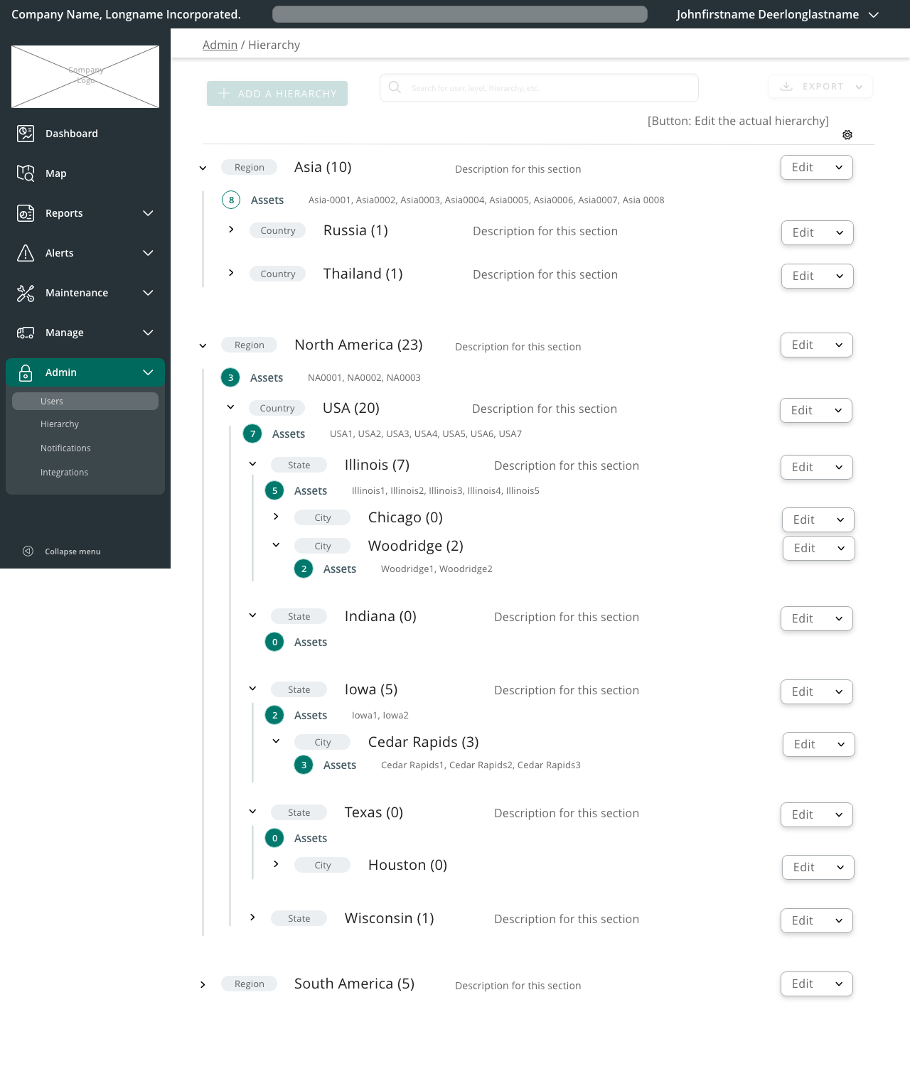
The product had developed many features over five years — but those features were added over the years as a response to customer demands. Over time, this piecemeal approach created an application that wasn’t cohesive: often, customers would underutilize or never discover features that were available to them.
I recognized that the product’s unintuitive flows and designs didn’t reflect how powerful the features were. The entire product needed a redesign — and I was able to get company buy-in by tying the redesign to the development team’s long-requested Angular-to-React rewrite project.
My Roles
- Content strategist
- UX researcher
- UX designer
- UI designer
- Information Architect
I led the push for the redesign, and handled all non-development tasks. I documented the process, facilitated team discussions, conducted user interviews, designed wireframes, ran user tests to iterate designs, and created a component library.
My Tasks
Research
- Competitor research: analyzed features and layouts from our competitors
- User strategy: Interviewed our sales team to get initial ideas about what features customers requested or used
- Analytics: Installed and analyzed tracking data in our application to determine which features were used the most, underutilized, etc.
- User interviews: Interviewed customers to determine problems with original application
- User tests: Interviewed customers to test designs
Some user roles we determined, which had widely different user goals and flows:
- Drivers
- Equipment operators
- Site managers
- Equipment maintenance crews
- Internal company analysts
- COOs
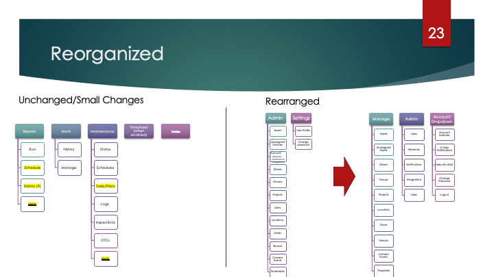
Information architecture
- User flow mapping
- Card sorting: broke all navigation down into separate elements, to determine a new information architecture (and ensure that the users wouldn’t be influenced by their existing knowledge of the application). User-generated structures immediately differed from ours, which indicated that we needed to reassess the IA. (Note: I renamed several features for the cardsorting test, so users wouldn’t be influenced by their existing knowledge of the application)
- Tree sorting: ran users through common tasks to analyze clarity of new IA
- Tools: Microsoft Visio
Wireframing
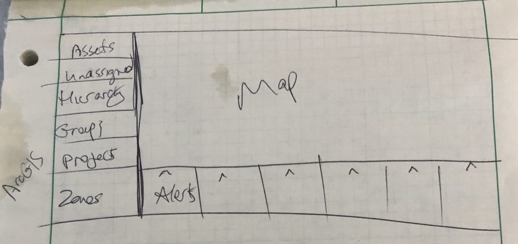
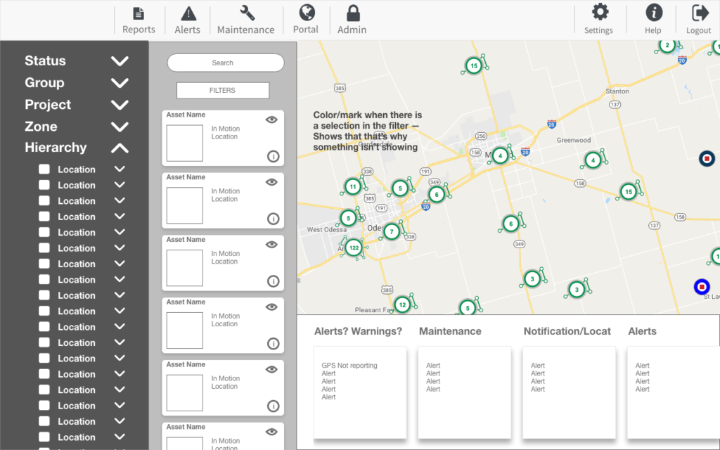
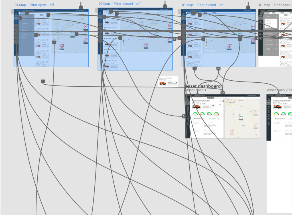
I iterated through several versions of the application with wireframes. Low-fidelity mockups made it much easier to test variations and come up with better iterations.
- Whiteboard and pen-and-paper sketches for internal buy-in
- Low-fidelity wireframes
- High-fidelity wireframes
- Tools: Adobe XD (Adobe CC), Sketch
Prototyping
I created clickable prototypes for customer participants to realistically interact with, to test the assumptions of the designs and find problems to fix.
- Created medium-fidelity and high-fidelity prototypes for user testing
- Ran task/goal-based user testing with prototypes.
- Tools: Adobe XD (Adobe CC), Microsoft Teams (for remote testing)
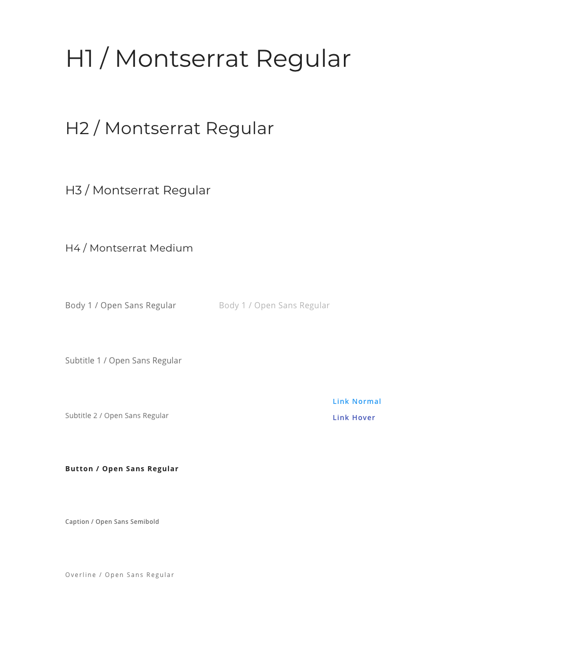
User Interface design
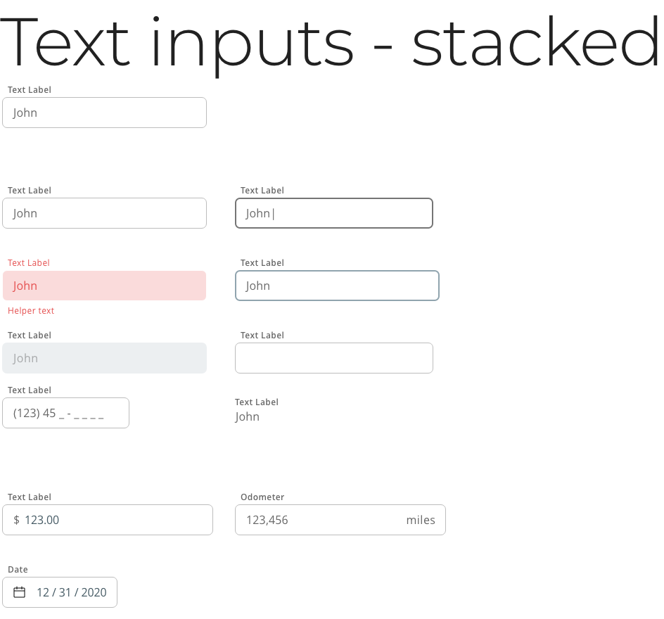
To maintain consistency, I created and implemented a design system for our product to use. This included everything from components, to typography, to page layouts. I chose the colors, typography, and icons.
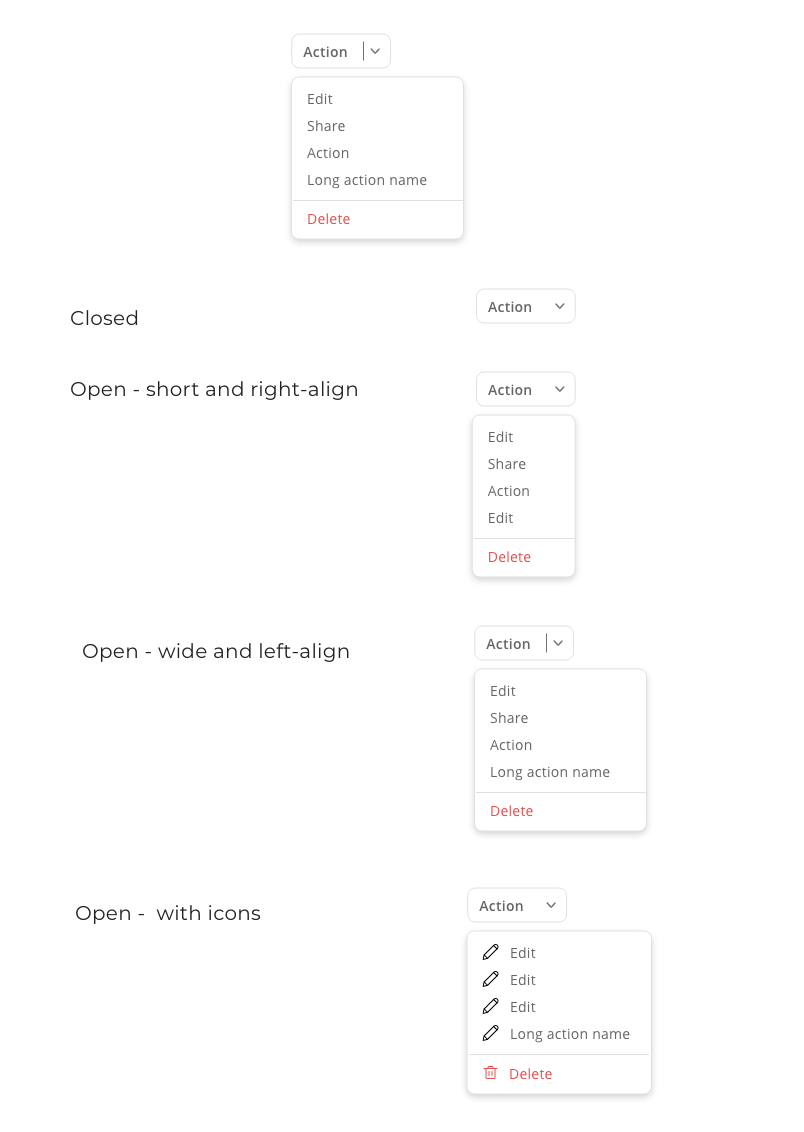
- Components: As a busy lone-UX-person, I made use of all the resources online, and used the styleguides of other companies as a base (Uber, Google’s Material Design, IBM, etc.). I added components sparingly, to allow for proper use and keep designs simple. Many components were simply never relevant, and any custom components were easier to create with everything else as a template.
- Icons: I chose Streamline’s vast icon library — in the rare cases that there wasn’t a suitable icon, I would create it in a matching style. The “regular weight” style worked well for both desktop and mobile applications; chunky or ultralight icon styles wouldn’t have worked as well across all platforms.
- Tools: Streamline icon set, Zeroheight, Iconjar
Documentation
- I gathered everything in our documentation, with information for developers when to use a component or not.
- When to use a template
Tools: Confluence, Zeroheight
Best practices 
Components – specs and utilization 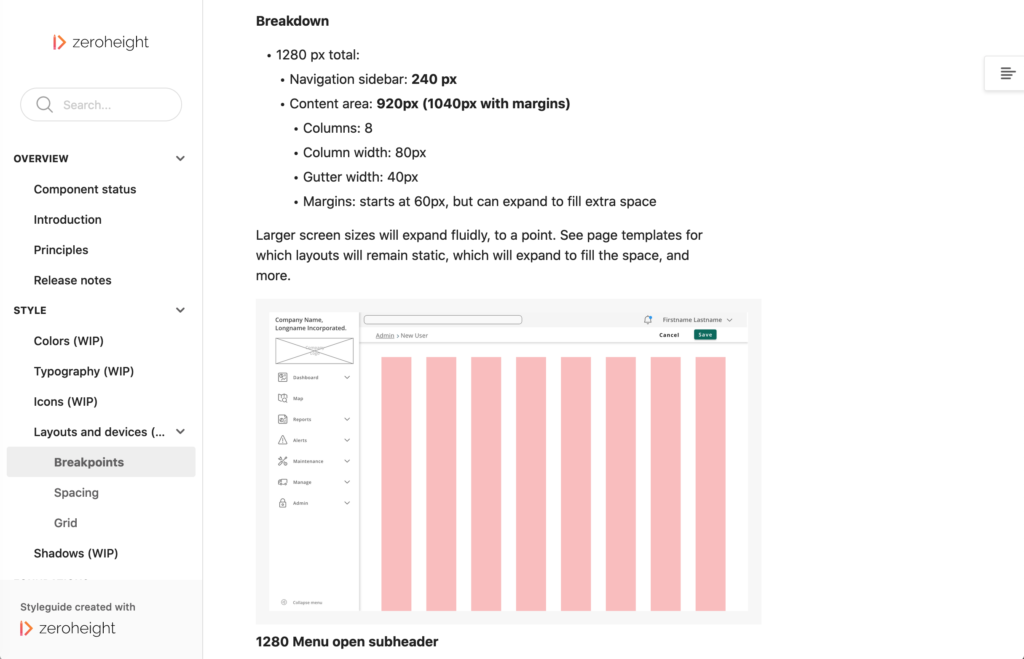
Page layouts

Outcomes
We released features throughout the course of the year, starting with some of the most basic/impactful changes, and moving on to each feature as it was developed. This let our users get used to our drastically different designs, but it did make the product look rather disheveled for a while! However, we worked closely with the marketing and customer service teams to keep them up-to-date with what was coming up, so they’d be prepared with release announcements and updated help articles.
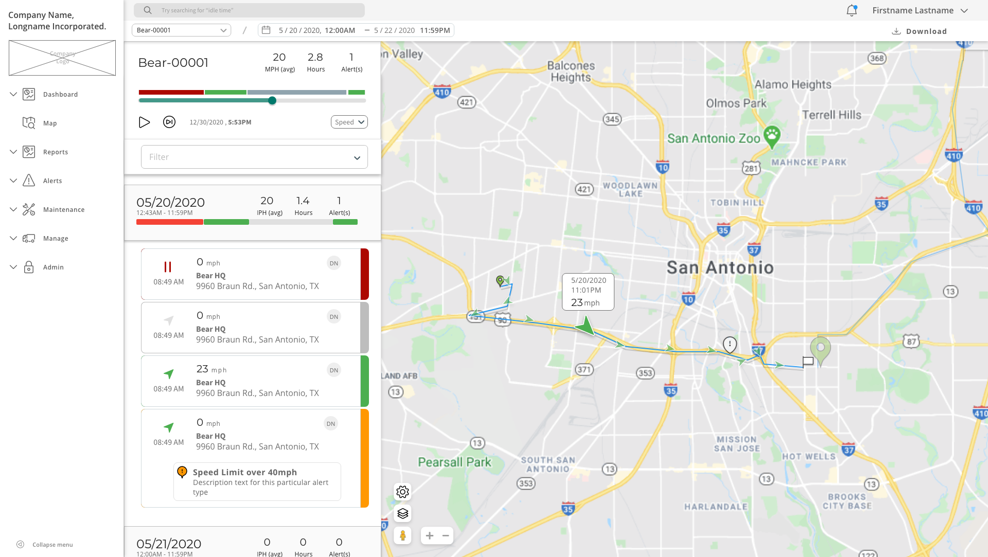
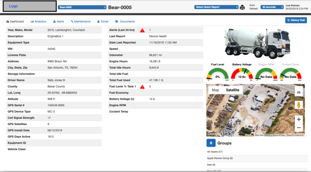
Location history tracker
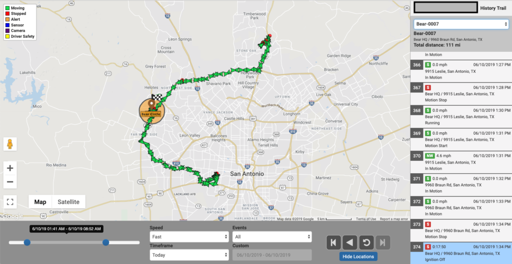
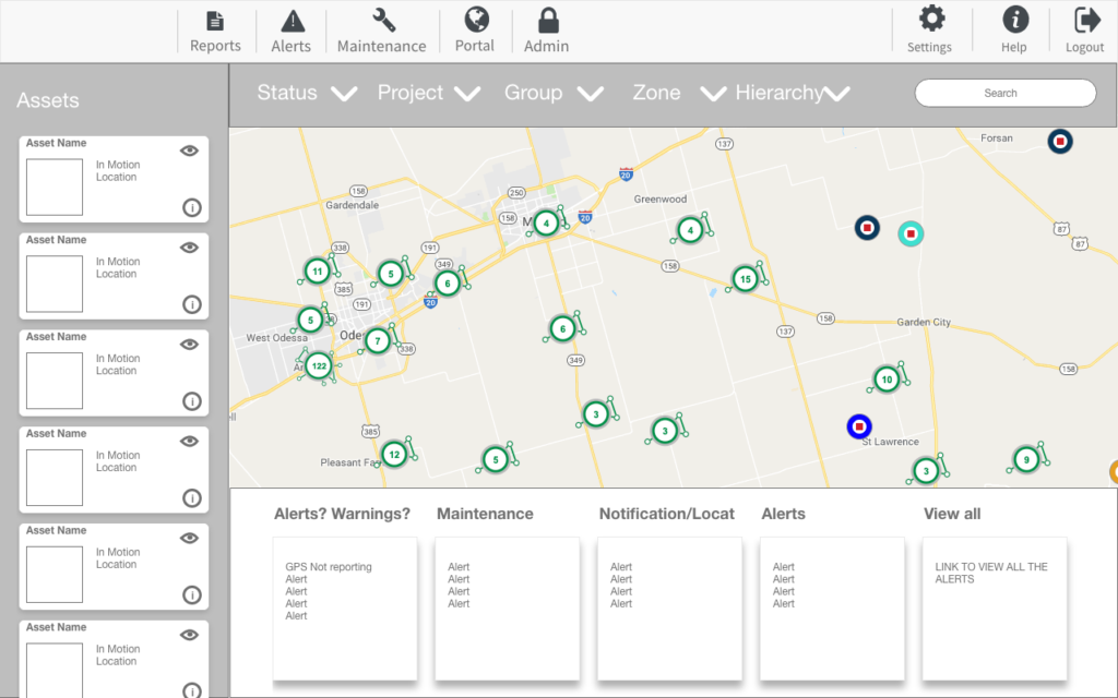
Original 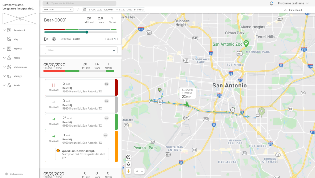
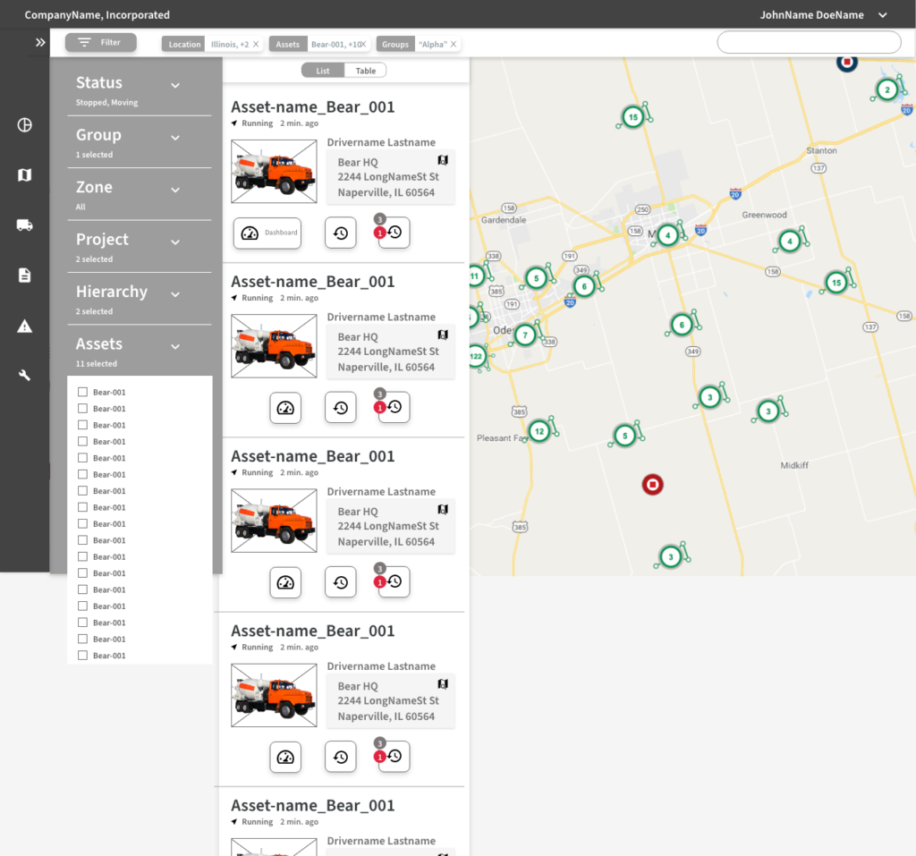
High-fidelity redesign
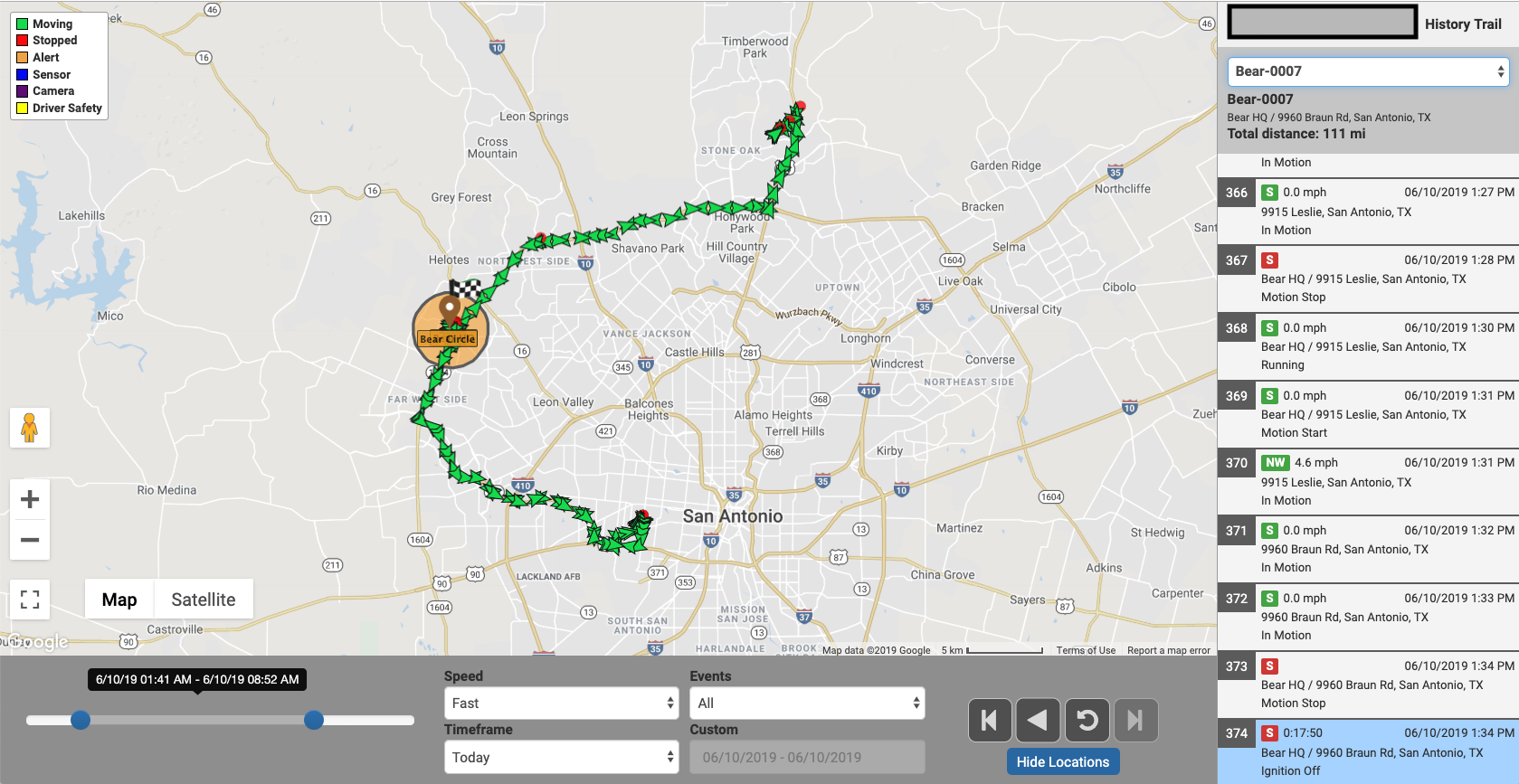
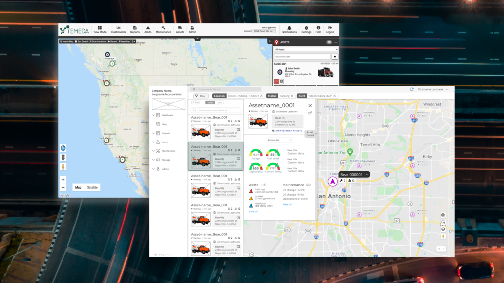
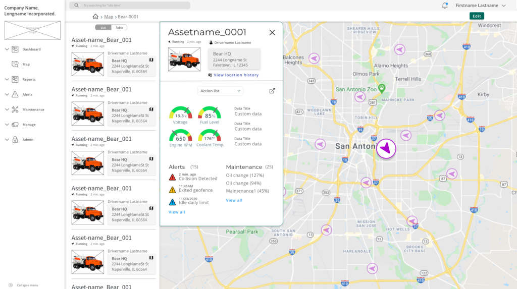
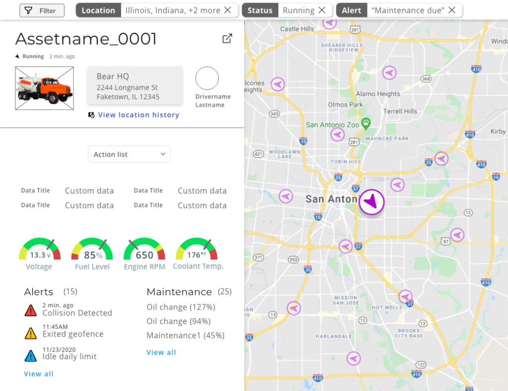
Asset detail
Old designs 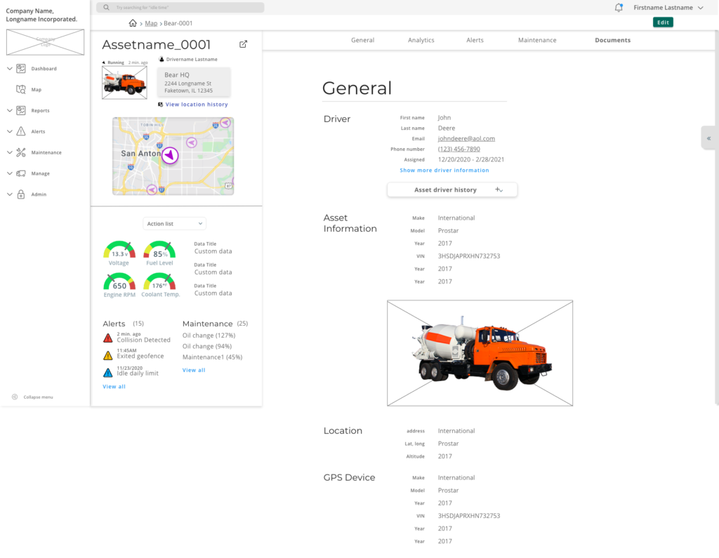
Near-final wireframes

