Summary
| Project Date or Timeframe | 11/1/2019 – 12/1/2019 (and more) |
| Major Tasks & Responsibilities | Audit existing content/information architecture, redesign information architecture, redesign layout of the help site, overhaul internal processes |
| Platforms | Web: desktop, mobile |
| Tools Used | Pen-and-paper, Excel, Adobe XD, WordPress (and a number of plugins). Documentation in Confluence. |
| Key Performance Metrics | Increased users Decreased pages-per-session Increased time-on-page (terminal) Decreased “level one” tickets |
| Team Members & Collaborators | Me: auditor, designer, developer Customer Service team: auditing and training |
Temeda’s Help Center is the company’s knowledge base, meant to provide another method of support for our customers and to aid our Customer Support (CS) representatives.
As we awaited go-ahead for our larger product redesign, I decided to lead a project that wouldn’t require developers, and would set a stable groundwork for updating information in what could become a chaotic rollout of our product redesign. Since the underlying problems of the application’s redesign would still exist in the months between, I decided that we could at least improve our help documentation and process.
I led the research, design, information architecture, and development of the new Help Center, and collaborated with our CS team to relaunch it.
Discovery
User testing
It was clear from my first day that our knowledge base was a high-impact area that needed improvements. During my first few weeks on the job, I made sure to note my own “outsider” observations of the knowledge base, while I still had the viewpoint of someone unfamiliar with the product.
Then, I interviewed actual customers (both new and longtime), in order to determine the usefulness of the knowledge base, and to suss out even more problems. In screen-sharing interviews, I asked users to find appropriate articles to help them with a variety of tasks in our app, and asked them to narrate their thought processes. This helped me understand how our users approached information gathering.
“We don’t use (the product) as much as we should because it takes too much time to train our people how to use it.” — one of our biggest customers.
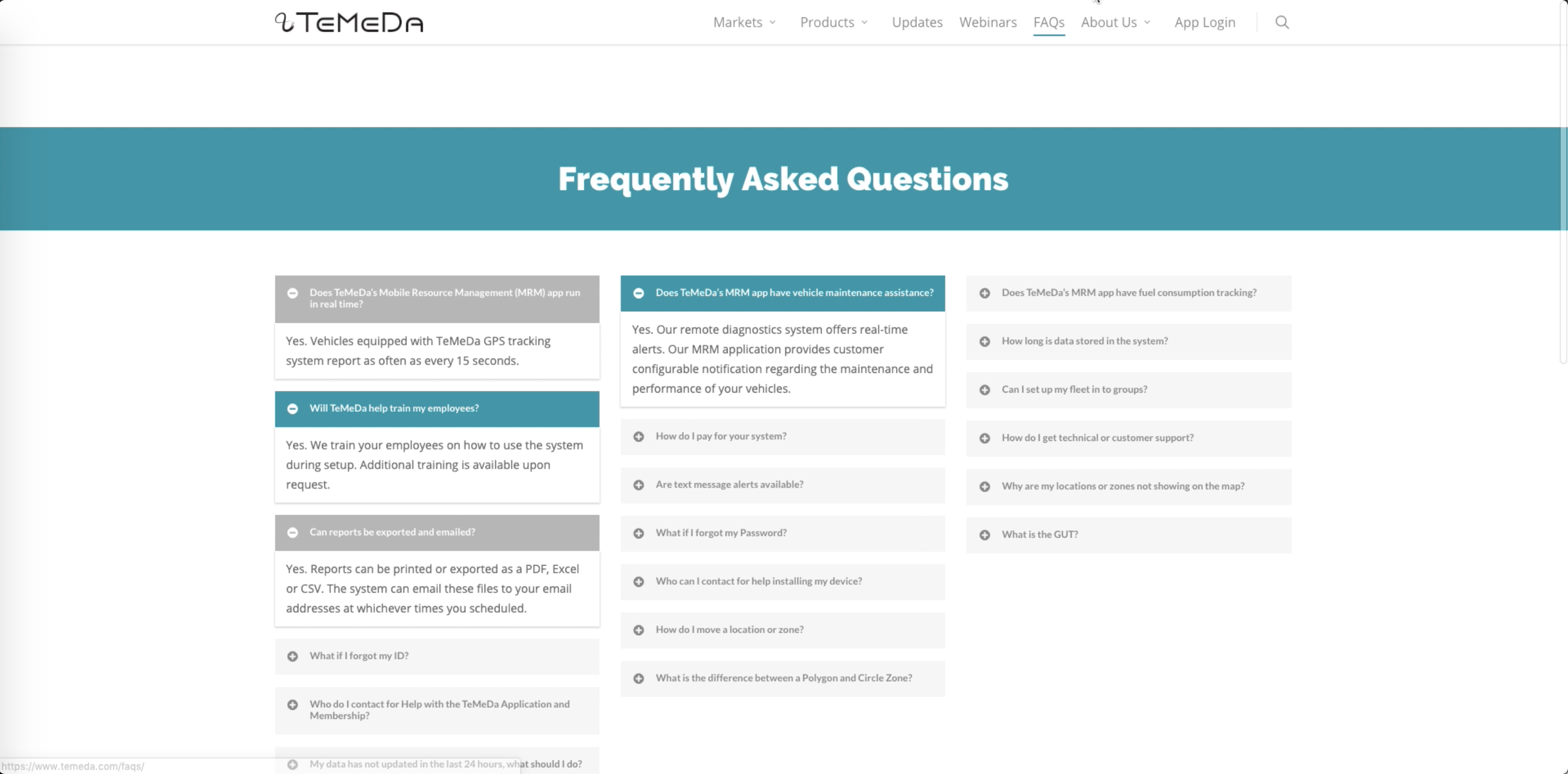
Competitive research
To determine best practices for knowledge bases and to prioritize features, I researched general software help sites for design guidelines, and researched competitor help sites for field-specific knowledge base architecture. The goal was to get in line with industry standards, rather than trying to reinvent the wheel.
Content audit
While we had plenty of preexisting content, it had been written and gathered haphazardly, as the company had operated as a startup for several years. This was the first concentrated effort to understand what help content we had.
As it turned out, we actually had several “help sites”.
- Help documentation written by developers, written and maintained as a page within the application
- Instructional webinars and installation tutorials, living only on our Youtube page and linked nowhere else
- The “main” help site, in WordPress
- Help documentation popup “tooltips” within the application, written by another developer and created in a 3rd-party extension section of the application, unable to be easily accessed or edited.
- Instructional flyers, handed out to customers and referenced on a single page deep within our main site
This was, obviously, a massive waste of resources and a nightmare to keep up-to-date and organized. I advised that the company have one “source of truth”, that would be published and maintained by our customer support team. This could ensure accurate information, consistent tone, and clear processes and ownership.
To organize everything, I created a master spreadsheet of all our current features, and articles based on each feature within the application. Related to that, I created a spreadsheet of features that didn’t have any documentation and required immediate content to be written, as well as any features that could also use a help article. This would be useful for the eventual redesign as well — I planned to have each section of the application link to the appropriate category in the Help Center.
Defining problems
After gathering all of the user feedback and audit results, I sorted the major complaints into three main categories: content, layout, and process.
- Content: problems with the actual content of the articles. This included anything dealing with writing/grammar, screenshots, formatting, etc.
- Layout: the visual structure of the site
- Process: the internal processes of the company to keep the knowledge base up-to-date and usable to customers
Sorting the information like this made it easier to understand where our problems were, and who needed to be involved in fixing it. Some examples of the problems are listed below.
Solutions & Designs
Information Architecture
I brought the Customer Support team in to lend their expertise on how the content should be organized. We did a virtual card-sorting exercise for our content, running it multiple times for multiple schema:
- Topic
- User
- Goal
- Format
We used this information to generate a new information architecture for our content, and added the additional categories to the home page sorting methods to create a better homepage experience.
Content
| Problem | Solution |
|---|---|
| Lots of content, but not organized or tagged | Led an audit of the posts, tagging them with anything that was relevant (i.e. an article on notifications could be tagged under “Alerts” and “Settings”, since it fell under both) |
| Main navigation/categorization was of format (article, infographics, video), not content | Changed categorization to each area of the application; in addition, added general categories like “account”. |
| Mixed info for phone app vs web app | Split articles into separate “browser” and “iOS/Android App” articles, thoroughly cross-referenced. Ideally, these would have been the same articles, but our mobile applications were so visually different that it could be hard to navigate. |
| Inconsistent formatting (headers, bolding/italicizing) | Standardized formatting in style guides, which would be used as resources during the drafting process |
| Long sections of text; multi-step processes written in a single paragraph (i.e. “First, press the red button, wait 12 seconds, then press the blue button. Press the red button again if the light flashes, or press the blue button if it doesn’t.”) | Writing style guide for step-by-step processes — for example: Bullet-pointed information if order doesn’t matter Numbered lists if order and steps matter |
Layout
| Problem | Solution |
|---|---|
| No search bar | Made the search bar front and center on the home page Placed a search bar in the header of all other pages |
| Hard to return to the home page | Added home page link Added a clearly-labeled link to the main site |
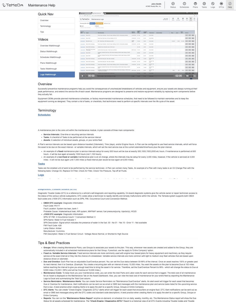
| Articles were too long | Added a Table of Contents widget as a fixed sidebar, which provided: A clear indication of the length and content of the article Easy navigation through the article (auto-generated anchor links) Clear indicator of current location (formatting changed as the user scrolled) |
| No contact information | Added telephone and form contact information. The company prided itself on telephone support, but email support is a useful tool for customers. I was even able to automate the process, connecting it to our internal ticketing system with basic information already filled in. |
Process
| Problem | Solution |
|---|---|
| No clear chain of command. Things might be written by the dev team, by marketing, or by customer support | Made Customer Support the end owner of every help article, and removed other knowledge bases. |
| No indication of when things happened (version), or if the information was outdated | Added internal version information; when a feature went live, and when the article was updated. As updates were added, it made it easier to see if something hadn’t been updated |
| Always being discovered too late that things were being changed | Added a step into our feature releases: determine if a release changed something enough to warrant an edit or a help article, and add it as a ticket for Customer Support |
| Screenshots were outdated | Created an internal master list/library of screenshots of the application; articles would reference this. This also made it easier to keep other media up-to-date (i.e. flyers, ads, content on the main website) |
| Users were unaware of new features | “Advertised” updates in customer resources; added in-app notification feature and a login page with links to recent updates and useful articles. |
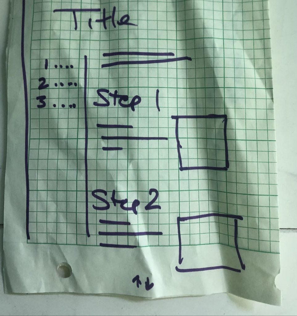
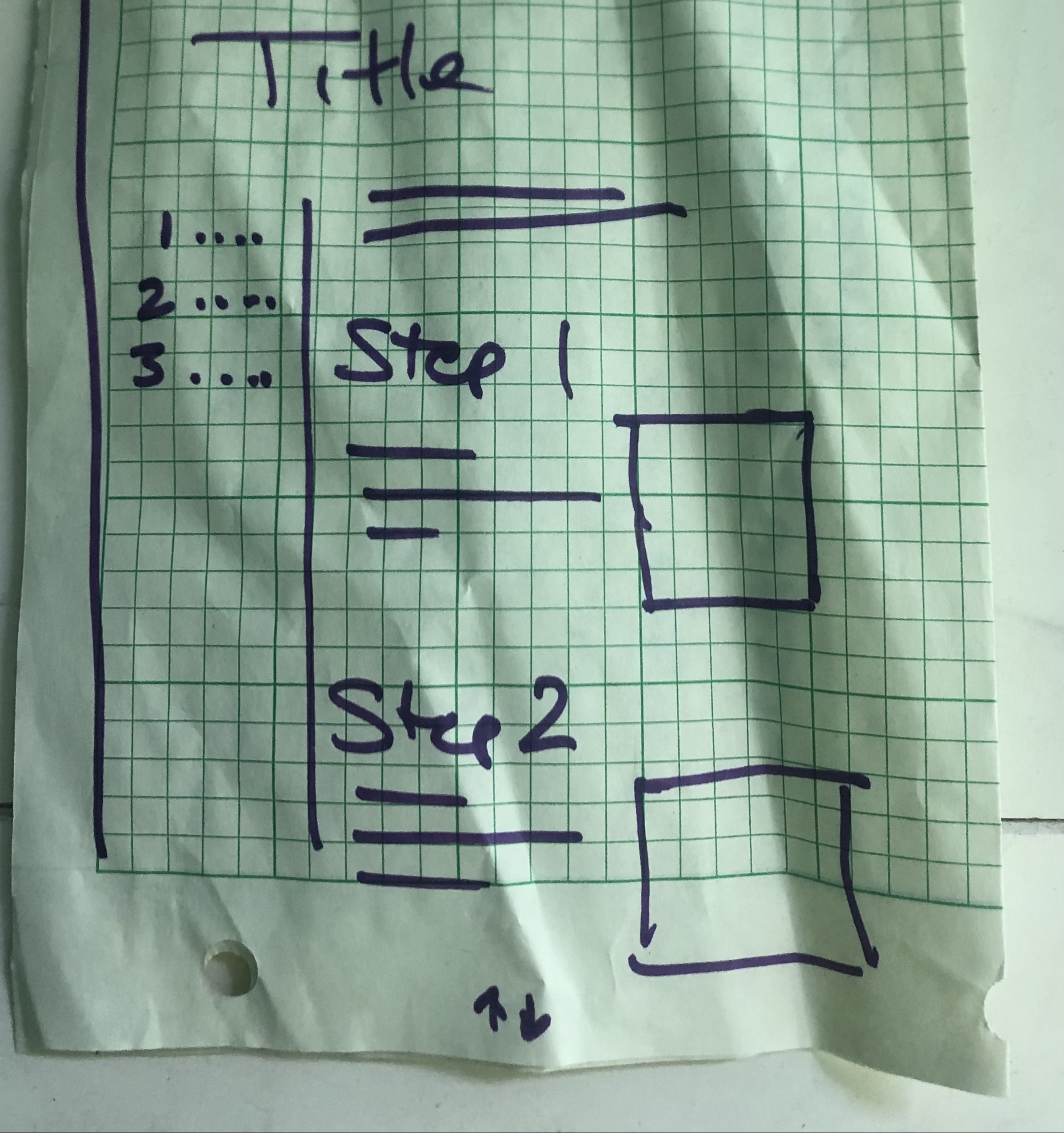
Wireframes
After determining the features that would be necessary for our knowledge base, I created low-fidelity and medium-fidelity mockups to user test the redesigns and guide development.
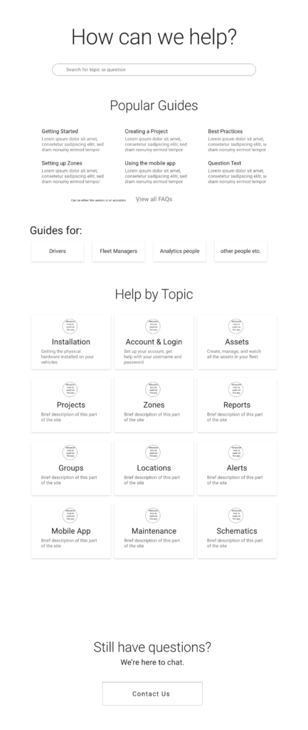
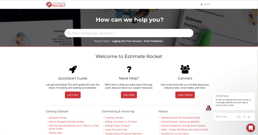
Homepage 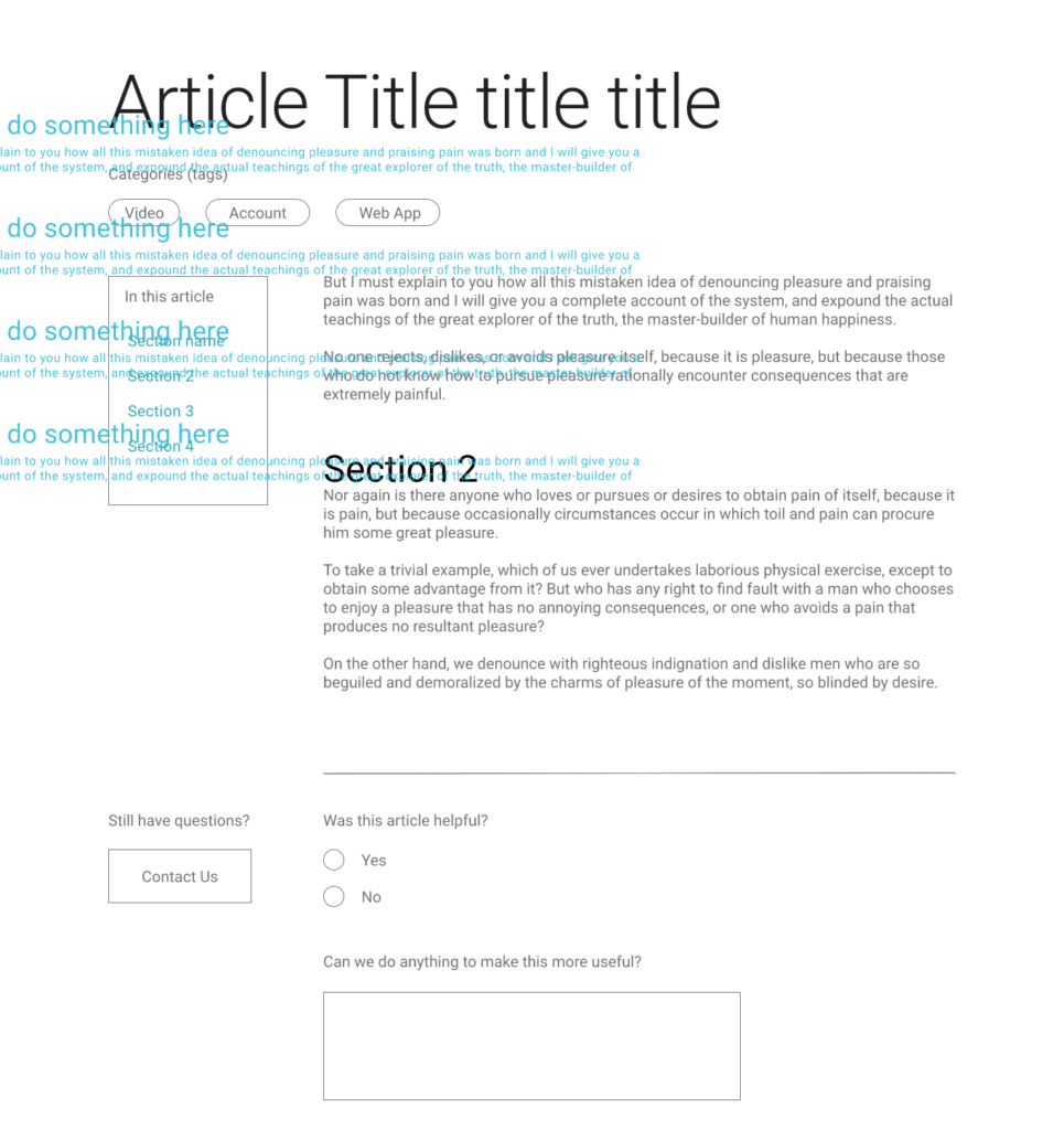
Article
Final product
As an experienced WordPress developer, I was actually able to take my designs and develop them directly! Granted, this doesn’t happen too often, but it certainly made it easy to keep things aligned with the designs!
Individual article
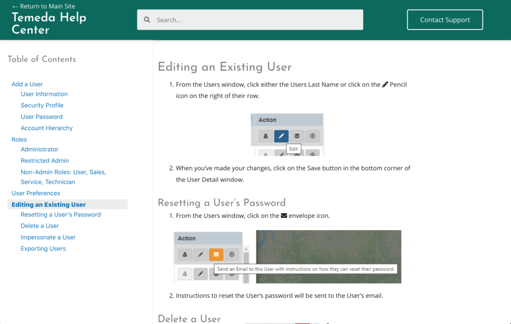
- Organized information under appropriate, consistent headings
- Summarized paragraphs of instructions into easy-to-follow numbered or bulleted instructions.
- Added automatic table of contents to make it easier to scan.
- Applied verb-first, bulleted writing when appropriate, and created summary paragraphs for necessarily long content areas.
- Lots of cross-referencing
Home page
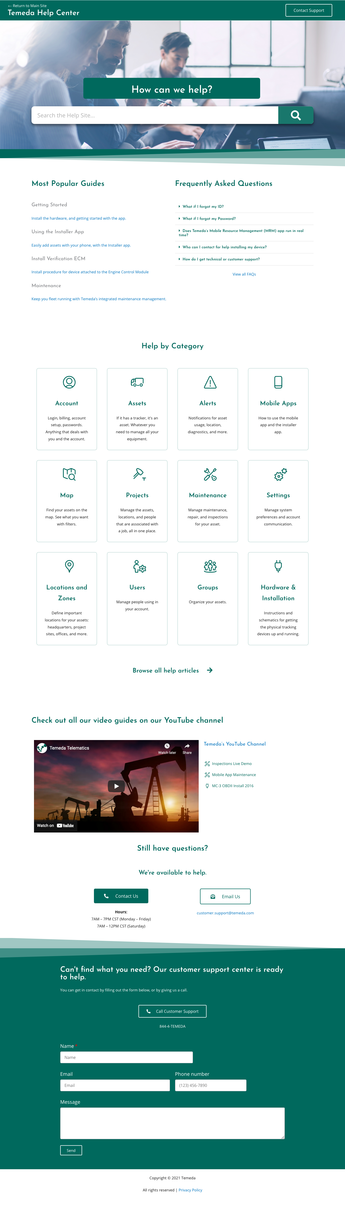
- Categorized by topic
- Categories were given brief descriptions to aid wayfinding
- FAQs and “popular guides” on home page
Internal processes and continuing operations
The project was fairly simple since I could handle the design and development — but the end goal was to have a separate team updating and maintaining it.
As noted earlier, this would be owned by the Customer Support team (CS). Some CS members were worried that an improved knowledge base would be grounds for reducing their hours; so I worked with them and management to incorporate it as a tool to augment and improve their internal processes.
In fact, in response to their explanation that the quantity of tickets cleared was a benchmark of their performance, I proposed to them and the COO that the Help Center’s KPIs should be incorporated into their performance KPIs. For example, since simple installation tickets could now be addressed with a Help Center article instead of a CS ticket, the pageviews of the article would count towards the ticket KPIs of whoever participated as an author. This encouraged the CS team to author Help Center articles that could cover common issues, and opened up CS time for higher-level tickets.
After getting buy-in from the CS team, there were several quality-of-life improvements and tasks to work through:
- Style guide: Getting a consistent tone in the writing. We had a bunch of articles, but they were written in a number of ways and without clear consistency in tone or photos. To solve this, I created a styleguide with links to writing resources, summarized key ideas with “do’s and don’t’s”, and rewrote a few articles as “before and after” examples. Simple techniques like verb-first, bulleted writing went a long way towards getting clean and clear articles.
- Auditing articles: Auditing the current knowledge base was a lot of work, so I recruited the CS team. I asked them to categorize articles into any area they thought appropriate, and if there were any gaps that they thought needed filling.This helped me in the original information architecture phase of the redesign, and I was able to save time and get more buy-in.
- Analytics: After installing analytics code into the knowledge base, I created some useful dashboards that automatically sent monthly reports to the CS team so they could see how the site was doing. One of the most useful pieces of information was “search terms”: it let them know what users were looking for and their final destination, and helped them decide what articles to write or edit.
Customer marketing
After all of this work, we wanted to make sure customers knew about all of the resources they had available! So we made sure that we thoroughly linked to the Help Center, and didn’t have any more “orphan” help information.
- Linked to the Help Center from our main website
- Linked to useful articles on our recently-redesigned application login page. Would change the links up periodically if we were receiving enough calls about a subject that could be solved with a help article.
- Replaced the dev-led help documentation within the application with links to the Help Center (eventually, wanted this to become embedded Help Center articles)
- Created a link in the header of the application to the Help Center
Conclusions & Learnings
Metrics
Prior experience told me to check to make sure our sites were being tracked in Google Analytics; since they weren’t, I installed the appropriate code within my first week working there so we had some baseline traffic.
Our success metrics were:
- Increased users: meant that our customers were more aware of the Help Center as a resource (eventually, we’d want the number to decrease after the redesign made it easier to use the application)
- Decreased pages-per-session: meant that users would quickly find their help article
- Increased time-on-page (terminal page): in conjunction with decreased pages-per-session, meant that users were finding their article quickly and reading it (as opposed to flitting around the site, trying to find what they needed)
- Decreased “level one” tickets: meant that users are able to answer easy questions without calling Customer Support
And indeed, all of them were met! Averaged, month over month for a year:
- Increased users: 80/month -> 200/month
- Decreased pages-per-session: 4.5 -> 2.4
- Increased time-on-page (terminal): 0:55 -> 1:30
- Decreased “level one” tickets: 40/month -> 15/month
Personal growth
Overall, I was very pleased with the outcomes of this project.
- I enjoyed the ease of designing and developing a project on my own. The positive feedback from customers and internal staff made it especially gratifying to complete, and I was happy to get such an impactful project completed, while larger projects were slowly making their way through the pipeline.
- I learned about knowledge base best practices, and how to audit a help site. In addition, I also learned how important it is to keep track of version changes and how they affect preexisting content.
- How to design for a seamless handoff to future owners:
- Involve future owners throughout the process! Find and address their fears, and get their feedback throughout.
- Revisit after handoff, to ensure that things are running smoothly and address issues that may have risen afterwards.