Overview
I significantly improved the user experience of an existing GPS history tracker within a larger map-based application.
The primary goal was to incorporate user needs for intuitive trip playback and comprehensive trip management, transforming a disjointed tool into a powerful and easily parsable feature.
Role
- UX Designer
- Researcher
- Tester
Timeline
- 4 weeks
Design Process
- Discovery
- Ideation
- Design
- Dev handoff
The Challenge
The existing GPS trip history tracker, while a core component of our map application, suffered from significant usability issues. Its interface had become disjointed and users found it challenging to easily parse relevant information.
Key pain points included scattered controls, a cumbersome date/time selection, and a lack of clear visual cues for trip data. This led to user frustration and inefficient data analysis.
Approach & Research
To address these challenges, I initiated a discovery phase focused on understanding user needs and industry best practices. This involved:
- Competitor Research: I conducted thorough research into existing fleet and asset tracking solutions, analyzing their user interfaces, information architecture, and playback functionalities. This research highlighted common conventions and user expectations for tracking historical data.
- User Feedback Integration: While direct user interviews were limited by the timeline, insights from customer support tickets and internal stakeholder feedback informed key pain points.
A significant insight from the research was the effectiveness of video playback controls for navigating time-series data. This served as the foundational metaphor for the redesigned UX, allowing users to intuitively scrub through historical trips.
Furthermore, a critical aspect of the design strategy was ensuring responsiveness. The new UX was conceived to adapt seamlessly across various devices—desktops, laptops, and tablets—with the column-based information intelligently collapsing for an optimized mobile view. This commitment to accessibility and adaptability was crucial, reflecting a broader commitment to robust design systems.
Solution & Impact
The redesign systematically addressed each identified problem, implementing user-centric solutions inspired by video playback paradigms and modern UI standards.
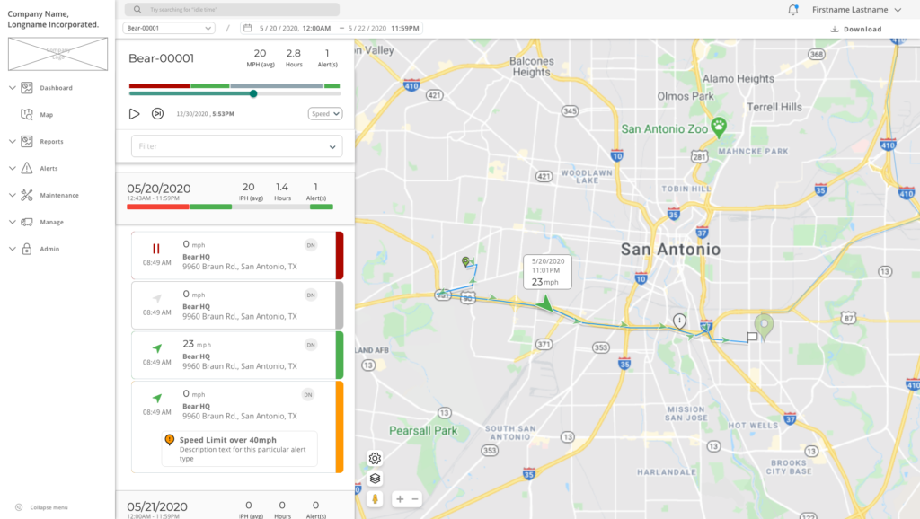
Problem 1: Dispersed & Non-Standard Playback Controls
- Original State: Controls were scattered across the interface, featuring unconventional elements like a “double-handled playback,” non-standard “start” versus “restart” icons, and an unclear section for playback. This led to confusion and a steep learning curve.
- Solution: The playback controls were entirely re-architected to align with standard video playback design conventions. This included:
- A simple timeline with a clear handle for scrubbing through the playback.
- An intuitive play/pause toggle.
- A universally recognized standard “restart” icon.
- A dedicated speed setting icon for adjusting playback velocity.
- Impact: Users could now instinctively understand and operate the playback feature, significantly reducing cognitive load and improving the efficiency of reviewing trip history.
Problem 2: Limited Date & Time Selection
- Original State: The date and time selector offered only discrete, predefined options such as “today,” “yesterday,” “24 hours,” “last week,” or “week to date.” This severely limited flexibility for users needing specific date ranges.
- Solution: A comprehensive combination date/time picker was implemented, providing:
- Prefill options for common selections.
- The ability to select a custom date/time range, offering granular control.
- Impact: Users gained full control over the data they wished to view, allowing for more precise analysis and research into specific historical periods.
Problem 3: Ambiguous Data Availability
- Original State: There was no clear visual indicator of whether data existed for a particular date without actively clicking into it and waiting for it to load, leading to frustrating trial-and-error.
- Solution: The date/time picker was enhanced to visually format each date based on data availability:
- Clearly indicating dates with data.
- Highlighting dates with no data.
- Differentiating dates that hadn’t happened yet.
- Impact: Users could instantly ascertain data presence, saving time and frustration by guiding them to relevant periods, thereby enhancing predictability.
Problem 4: Difficulty Differentiating Map Moments
- Original State: Individual moments on the map were hard to distinguish, making it challenging to follow the flow of a trip or identify significant events.
- Solution: Individual moments were logically grouped into “trips,” which could be highlighted on the map for easy viewing.
- Impact: This grouping provided a higher-level organizational structure, making it much easier to comprehend and navigate entire journeys rather than isolated points.
Problem 5: Inefficient Information Consumption
- Original State: Reading through all movement information was time-consuming, and quickly finding important moments was difficult due to a flat information hierarchy.
- Solution: Each moment was formatted as individual cards, presenting information in a clear hierarchy with helpful use of color for easy scanning and searching. This included:
- Visually depicting the heading.
- Making speed the priority information.
- Reducing redundant information in the time field.
- Impact: The card-based format enabled users to quickly scan and digest information, rapidly identifying crucial details and improving overall data comprehension.
Problem 6: Lack of Daily Summaries for Multi-Day Ranges
- Original State: There was no easy way to calculate or view information for individual days within a multi-day range; users had to click into each day separately.
- Solution: A daily summary was added for every day selected in a range. Moments within each day could also be collapsed for quick, aggregated information.
- Impact: This feature provided invaluable aggregate data, allowing users to analyze daily performance at a glance while still retaining the option to drill down into specific moments.
Problem 7: Scattered Map Settings
- Original State: Map settings were scattered throughout the page, with “hide locations” separate from zoom, map, and street view options.
- Solution: Map settings were consolidated onto the map itself, leveraging an updated Google “layers” UI for a more cohesive and intuitive control experience.
- Impact: A centralized and familiar control panel streamlined map customization, enhancing user control and reducing navigational overhead.
Conclusion & Next Steps
This redesign successfully transformed a disjointed GPS history tracker into an intuitive and powerful tool for trip management and playback. By prioritizing user needs, applying established UX patterns (like video playback controls), and focusing on clear information hierarchy and responsiveness, the solution significantly improved usability and efficiency.
Future iterations could involve deeper analysis of user interaction data post-launch, exploring advanced filtering options, or integrating predictive insights based on historical trip patterns.