Project Overview
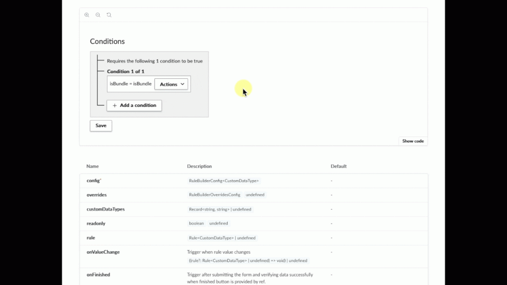
The Rule Builder, a critical component that allows users to construct logical expressions, was a significant point of friction. It was difficult to learn, hard to use, and contributed to a high onboarding churn rate.
This component had been a known issue for a while, but we were finally able to get dedicated time to work on it because its poor design was also a huge accessibility failure—and a large customer required our product to be accessible.
I led the end-to-end UX process to transform this frustrating tool into an intuitive, accessible, and reusable component, making complex logic approachable for every user. My work was grounded in early and continuous user research, cross-functional collaboration, and a component-based design approach.
By the end, we created a validated, intuitive, and accessible Rule Builder component that:
- Dramatically improved user understanding and speed, based on user testing.
- Reduced development time by being reusable across multiple products.
- Enhanced accessibility compliance for all users.
Team
- 1 Product Designer (Me)
- 1 Junior Product Designer
- 1 Product Manager (with others providing input)
- 2 Senior Engineers
- 2 Engineering teams (2-10 people)
Timeline
- Research: 2 months
- Low-fidelities: 1 month
- Prototypes: 1 month
- Testing: 1 week
- Refinement: 2 weeks
Process
- User research & discovery
- Low-fidelity ideation
- User interviews
- Design
- User testing
- Dev handoff
- Components implemented
The Problem
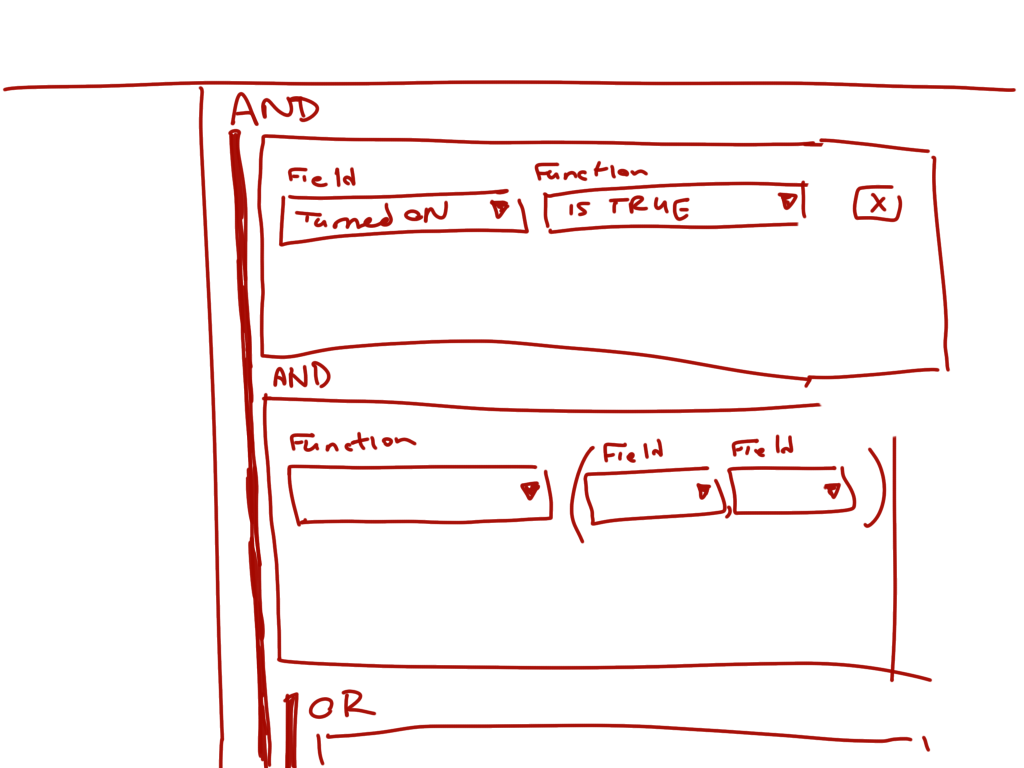
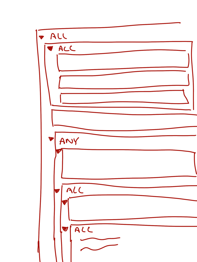
The core challenge was to simplify the complex task of building logical expressions for a user base that wasn’t necessarily technical. The existing solution failed by presenting a dense, confusing interface that was both inaccessible and difficult to learn.
Key Issues:
- Inaccessibility: The legacy component was not built with accessibility standards in mind, creating barriers for users with disabilities. It failed on several levels, in perceivability, operability, and predictability. This included issues such as color contrasts, chaotic screen reader order, and inaccessibility with keyboarding and other assistive technology.
- Low Onboarding Rate: New users found the system so difficult to use that many organizations opted to hire external consultants to set up their rules.
- Development Inefficiency: Without a shared component, product teams were constantly reinventing a similar functionality, leading to inconsistent user experiences and wasted resources.
“I’ve used this daily for the past 2 years, I didn’t know I could do that!”
Preliminary User Interviews
My Approach
I treated this as a strategic redesign, starting with a deep dive into user frustrations and finishing with a validated solution ready for componentization.
Discovery & Research
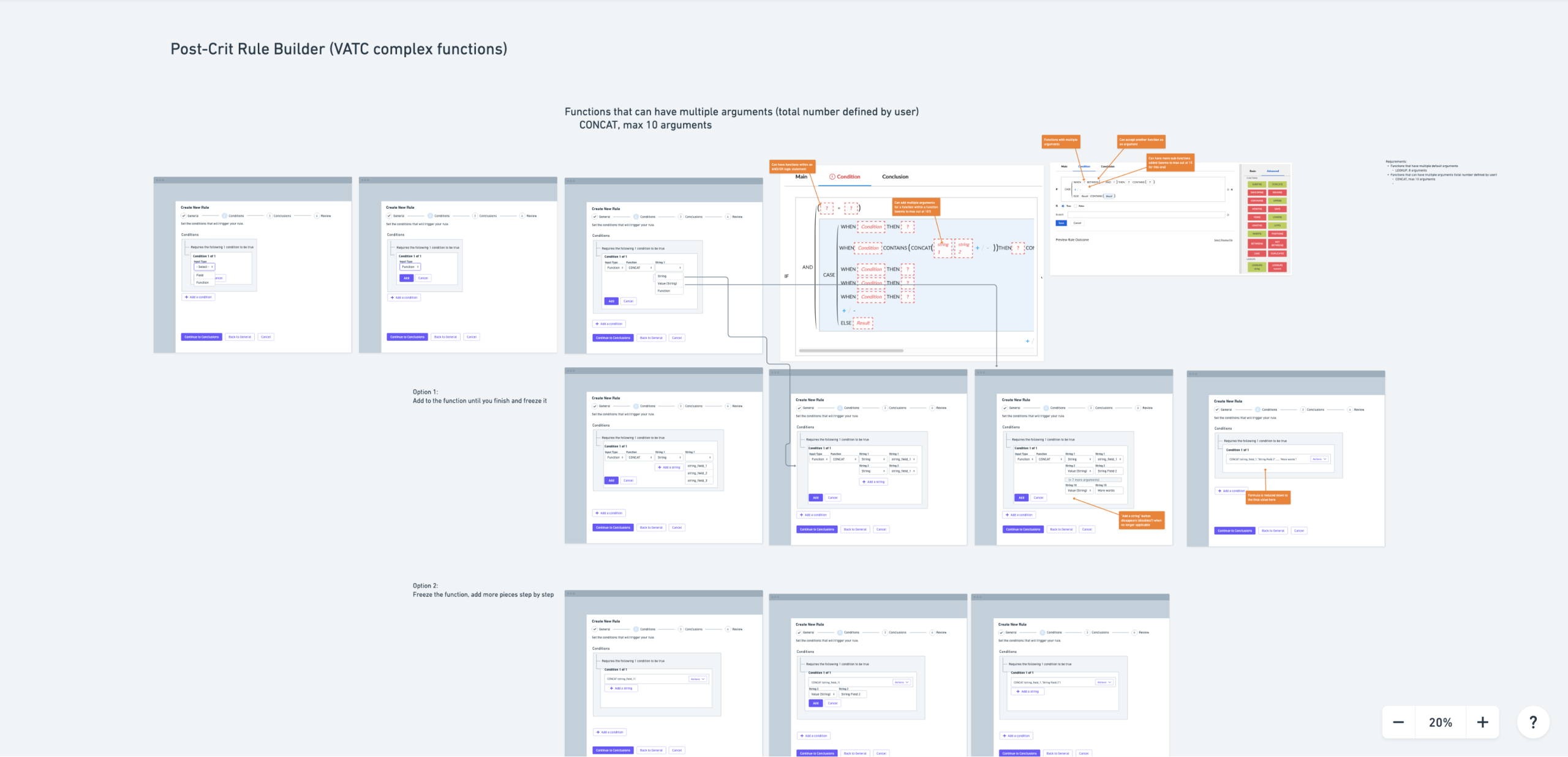
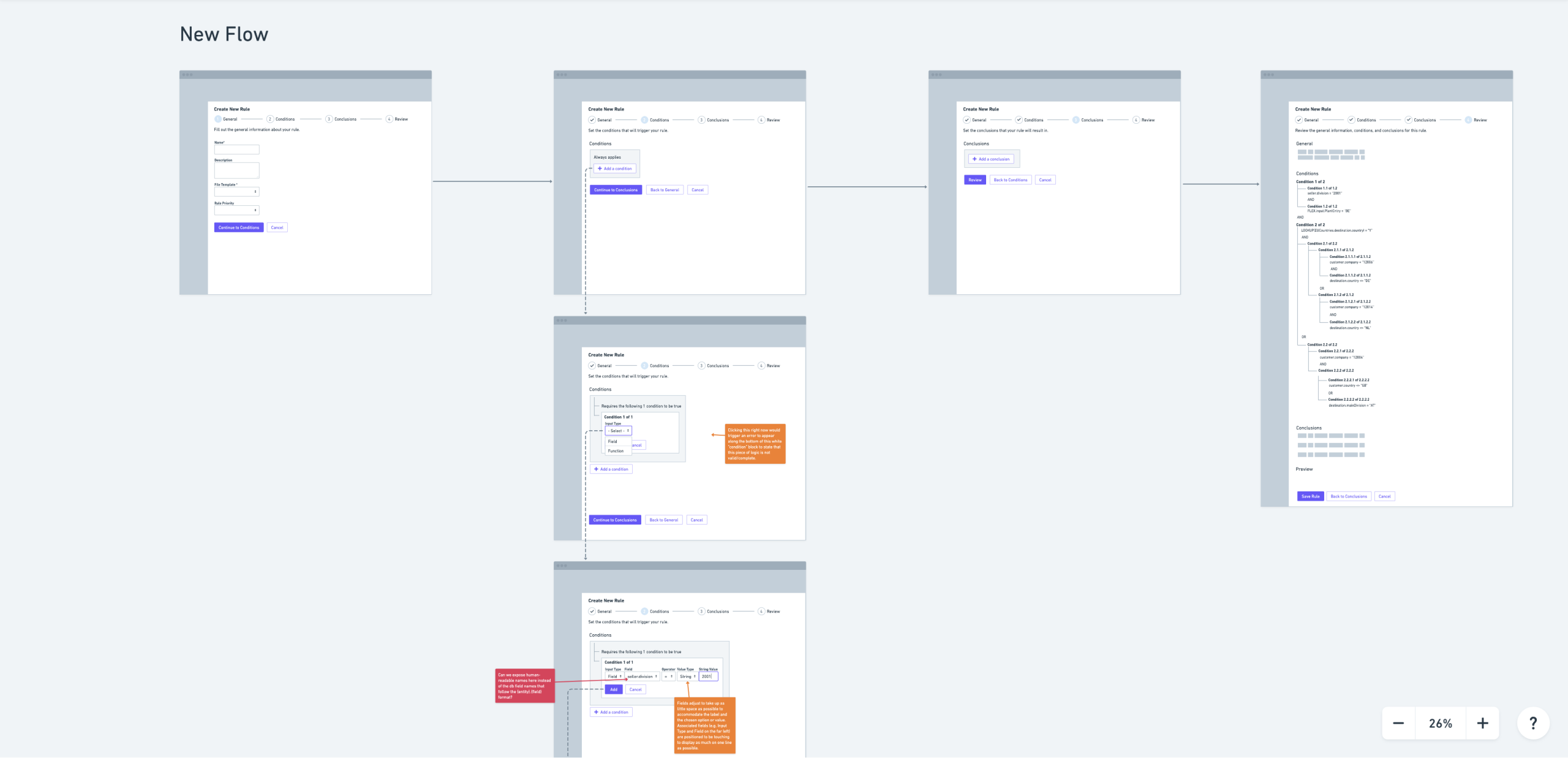
I began by documenting the accessibility issues with the old component so we had a clear understanding of the full scope of the problem. I also collaborated with developers and product managers to get a list of their requirements. From there, I drew inspiration from other sources like logic builders, rule builders, and filter builders to see how others solved similar problems.
Design & Iteration
My design process was an iterative loop of low-fidelity concepts, user testing, and high-fidelity refinement.
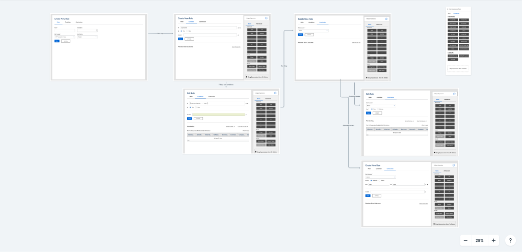
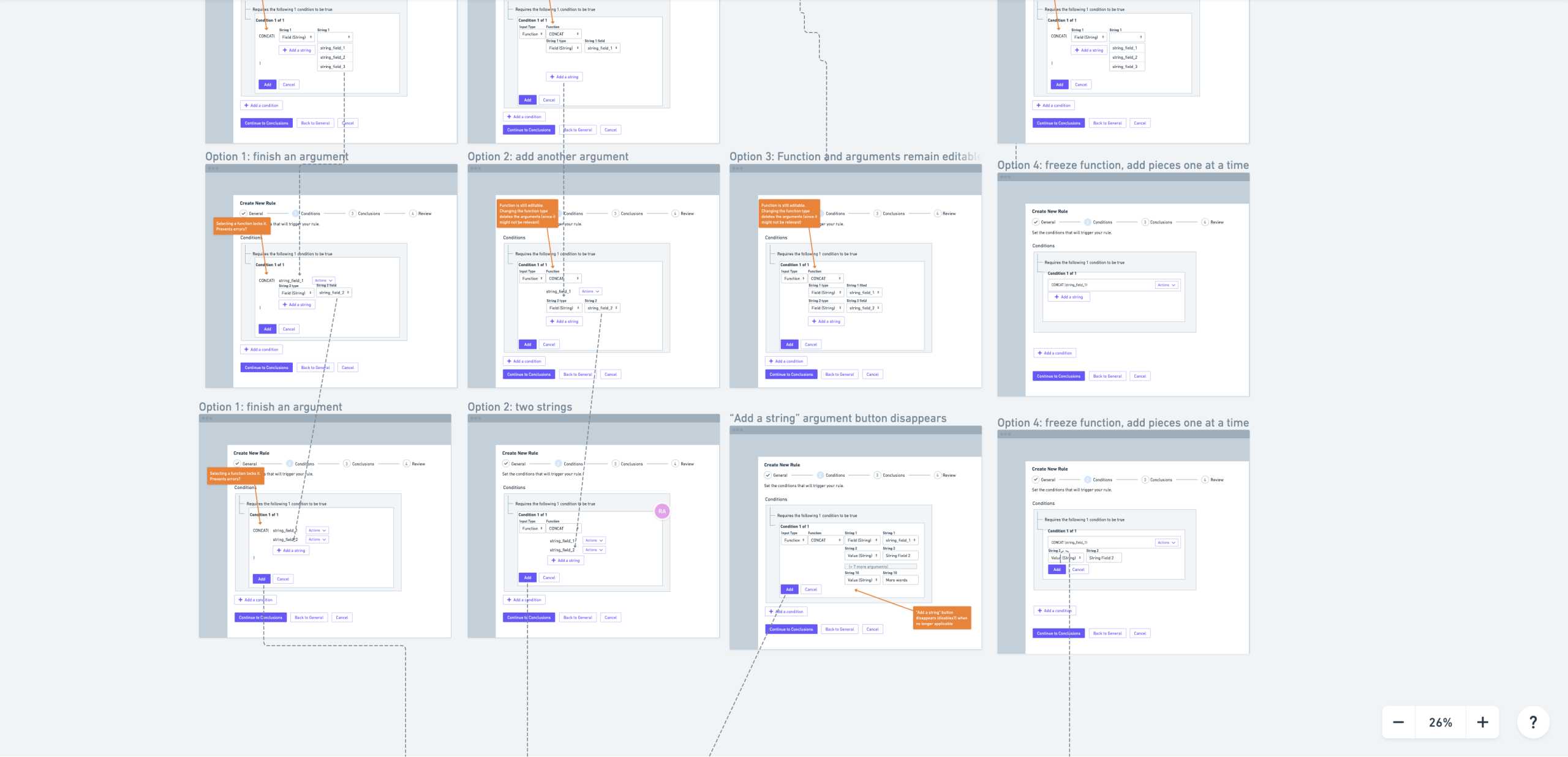
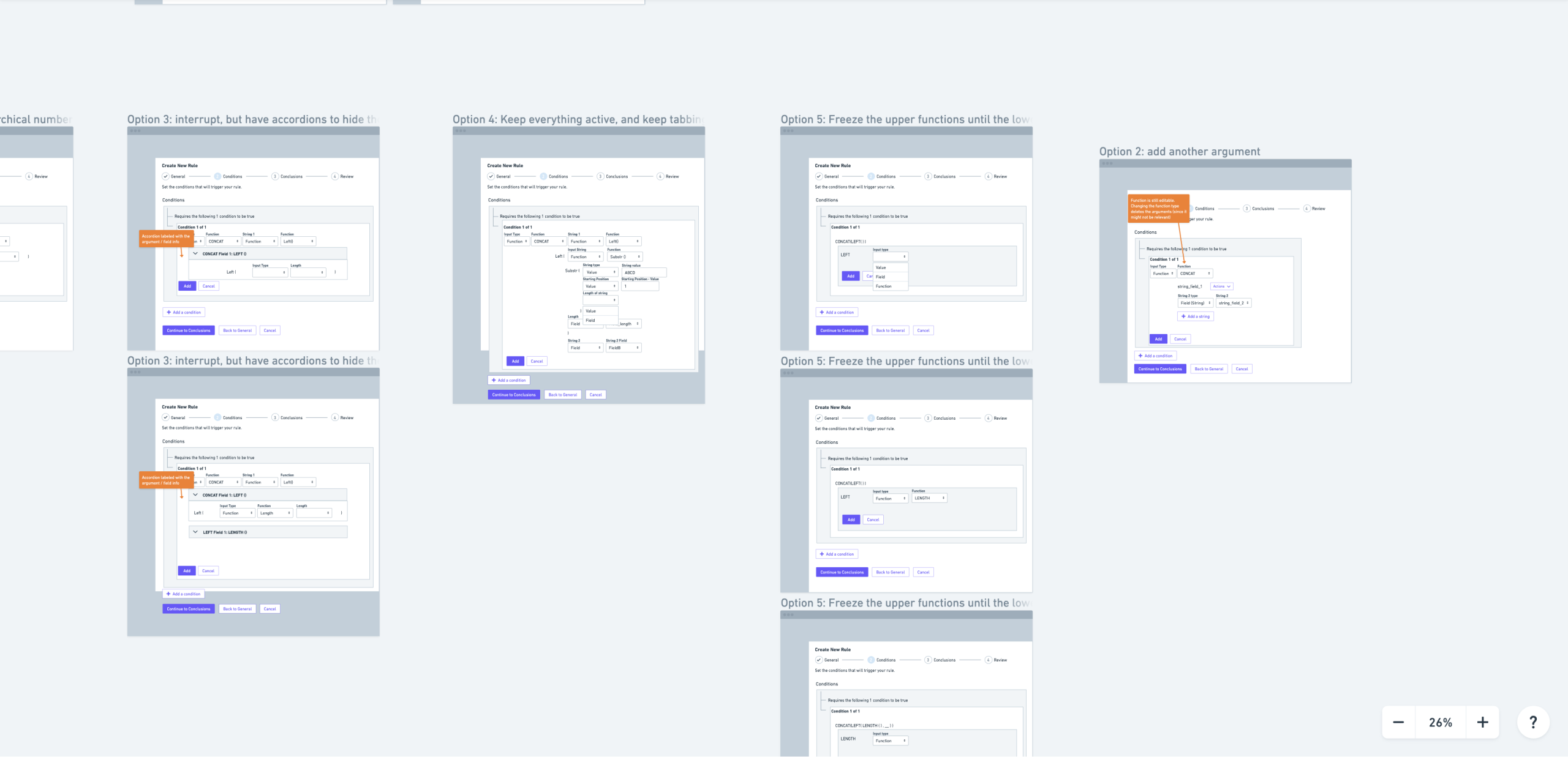
- Low-Fidelity Prototyping: I collaborated with other designers to put a bunch of ideas together and collectively chose the ones we wanted to move forward with. I brought these concepts to the developers and product managers for early sign-off.
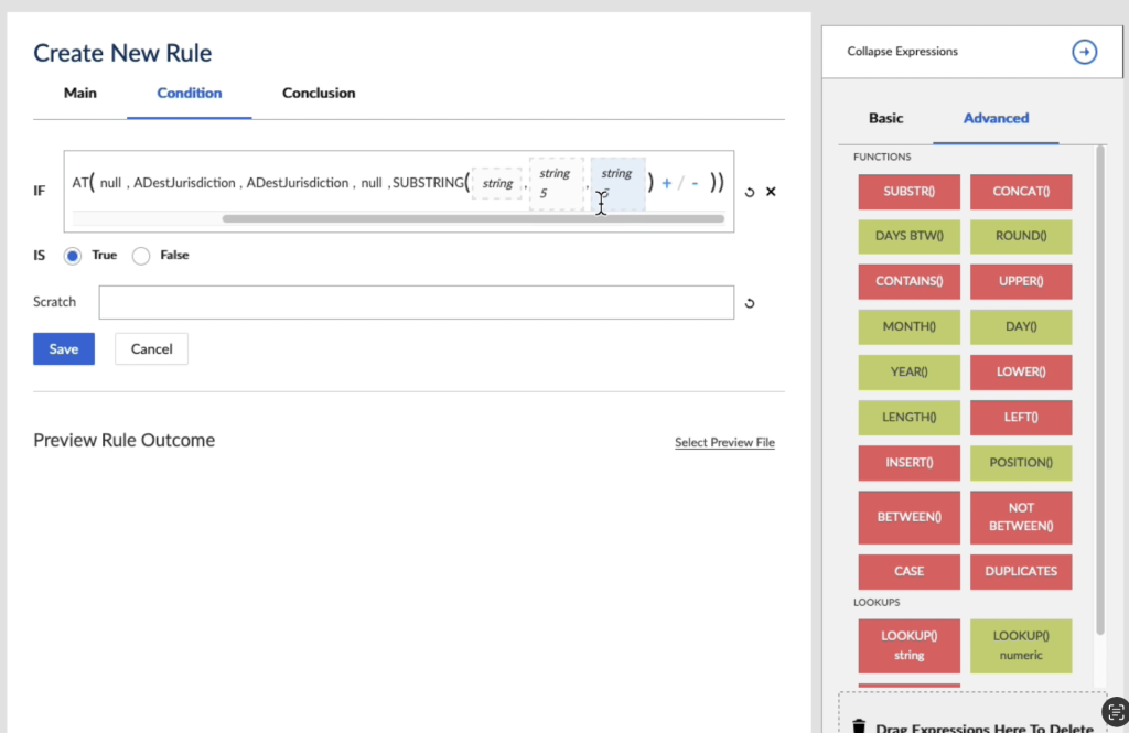
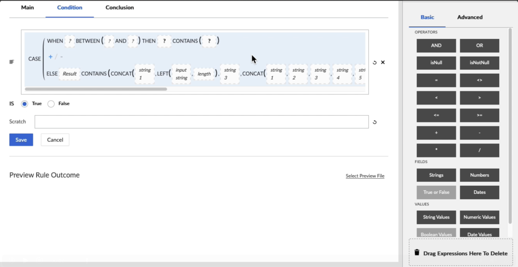
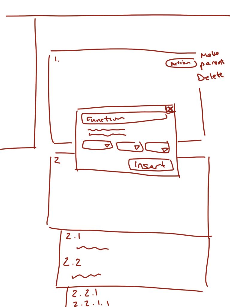
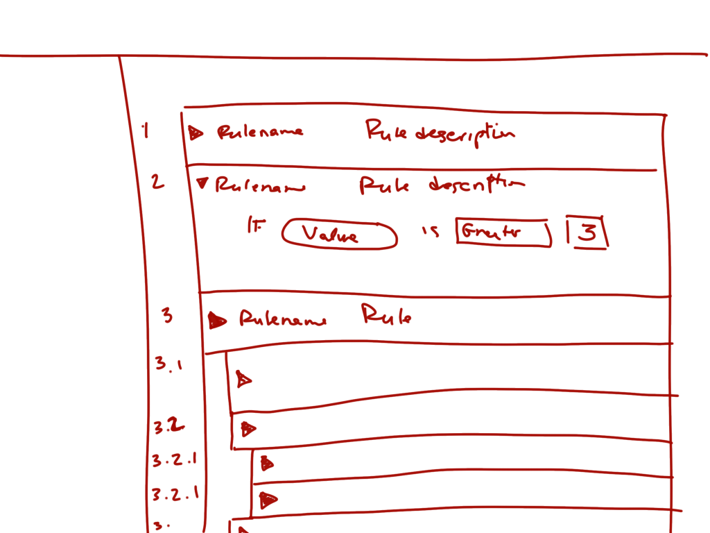
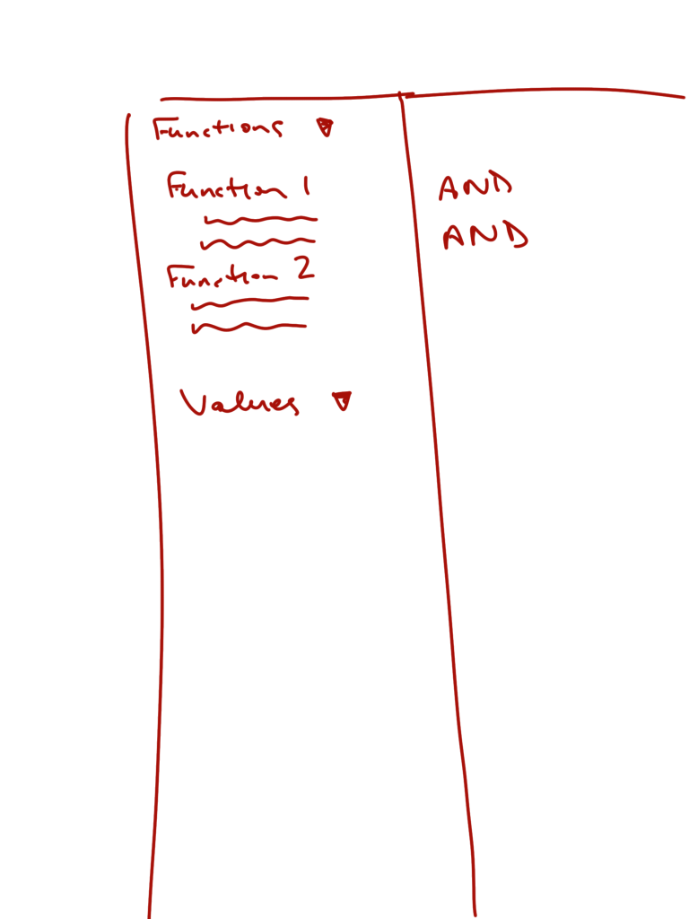
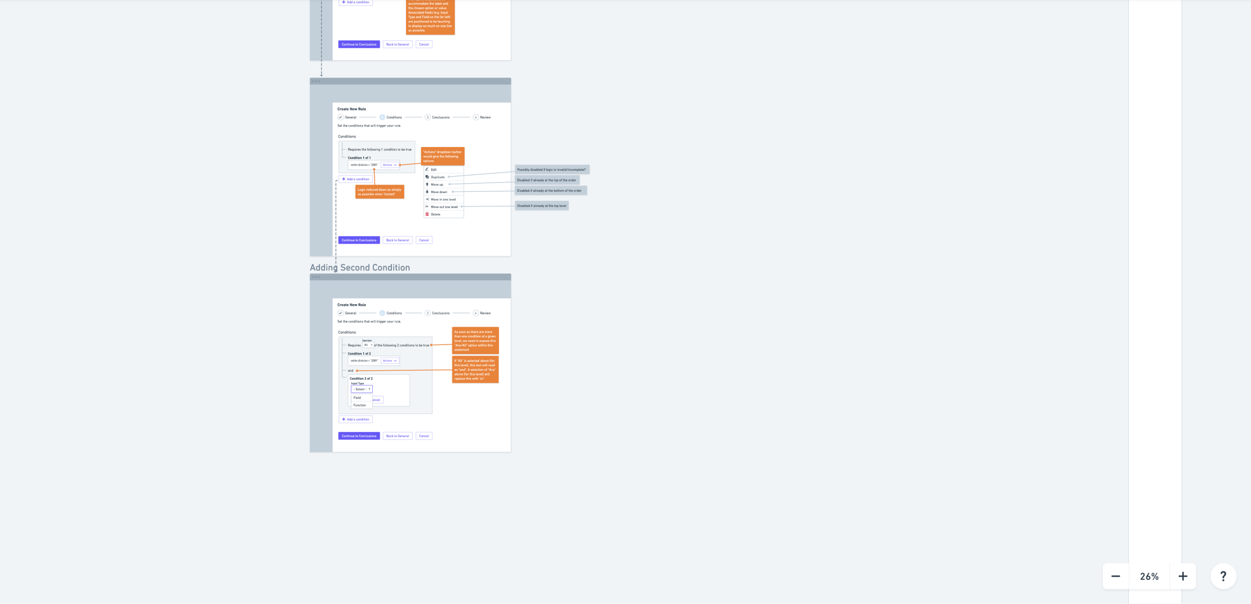
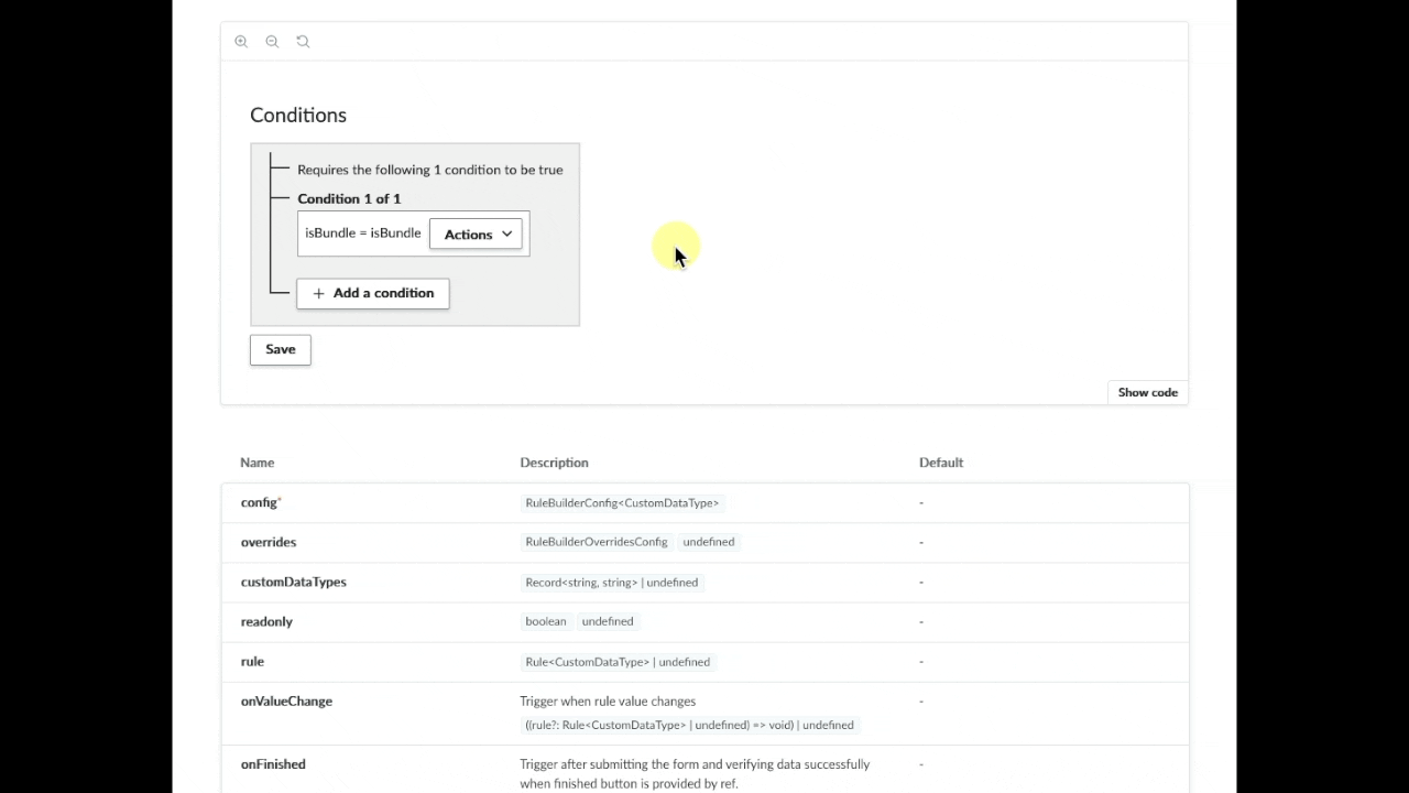
- High-Fidelity Design: The final design was built with simplicity, clarity, and accessibility at its core. We created the design with attention to conditional logic, so users couldn’t grab an argument that wasn’t valid for that space. We also included all states, such as error, edit, focus, and hover states. As a benefit, the new design showed that accessible design is also better for everyone. By making the component fully tabbable and keyboardable, it had huge benefits for power users who prefer keyboard shortcuts to mouse control.
Collaboration & Validation
This project was a true cross-functional effort. I worked closely with product managers to define user stories and key performance indicators (KPIs) and with developers to establish technical standards and implementation plans early in the process.
My work culminated in in-person user testing to validate our design decisions. The results were conclusive.
The Outcome
The new Rule Builder was a resounding success, delivering measurable value for both our users and the business.
Key Findings from User Testing:
- A huge success! Both for longtime users and first-time users.
- Every test time was faster and more accurate with the new version.
- Immediate Understanding: New users understood how to construct a rule on their first attempt, a stark contrast to the previous system.

“Is this going to be implemented soon? Because I’ve never built a rule but I was able to figure it out so quickly!”
Prototype User Testing
“When will this be released? I spend so long editing these rules, this will save me so many hours each month.”
Prototype User Testing
Business Impact:
- Improved Onboarding: The intuitive design smoothed the onboarding process, reducing the need for extensive support and increasing customer satisfaction.
- Developer Efficiency: By designing the component to be reusable, we saved an estimated thousands of developer hours across multiple products, ensuring consistency and a higher-quality user experience.
- Accessibility: The project led to a fully accessible tool, opening our product to a wider audience and demonstrating our commitment to inclusive design.
Conclusion & Reflections
This project was a powerful testament to the value of designing for clarity and accessibility from the ground up. By deconstructing a complex logical tool into an intuitive, visually guided experience, we not only solved a major usability problem but also created a foundational component that will benefit our product ecosystem for years to come.